The Guide to Landing Pages
Ready to level-up your lead generation and sales funnels? Learn landing page best practices, optimization tips, and more in this landing pages guide.
Whether you’re branching out into new audiences or engaging with your existing customers, landing pages make it possible for you to deliver the right targeted message to the right audience at the right time so that you can get the biggest possible return on your time and money.
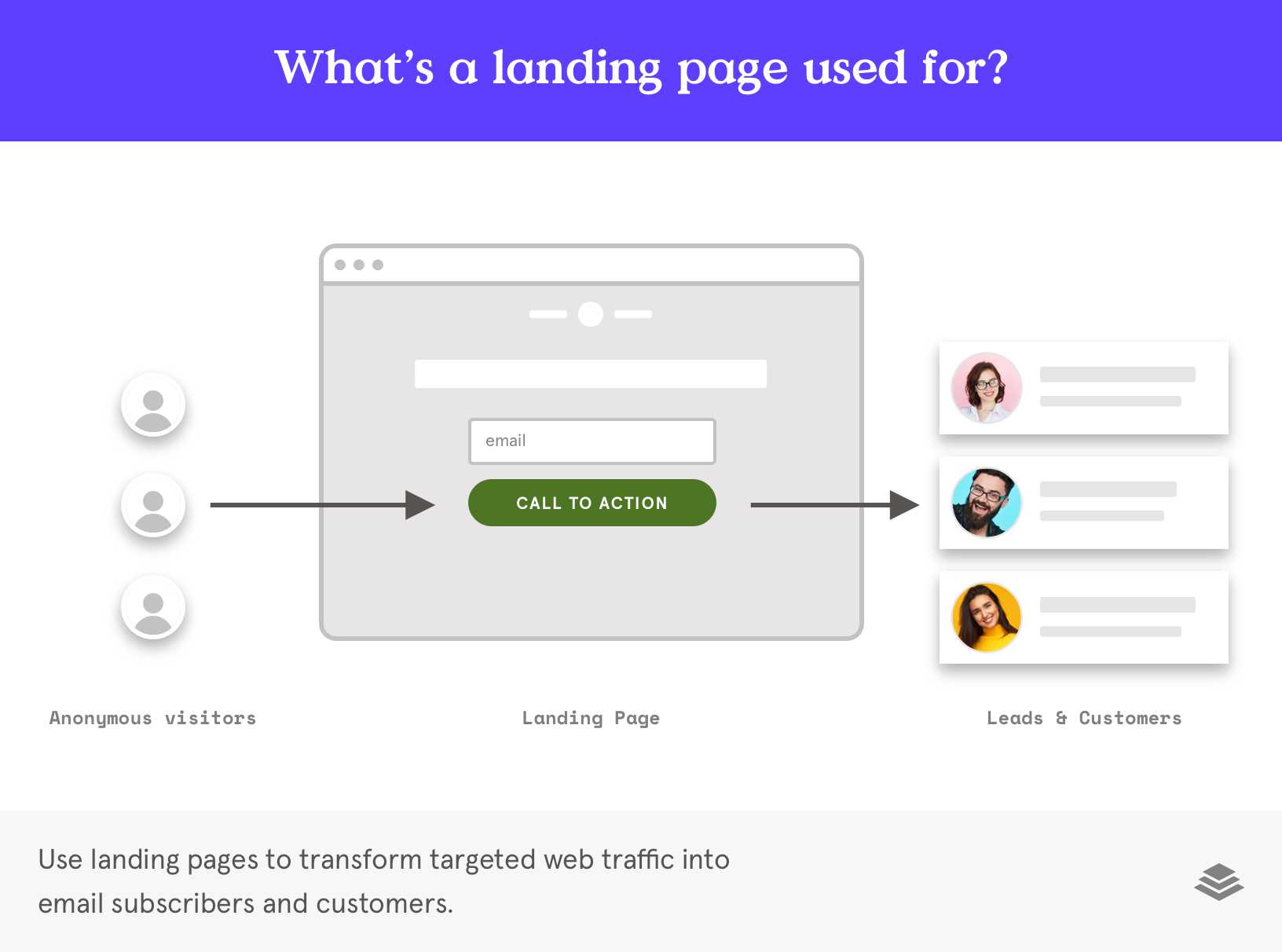
What is a landing page?
In the world of web pages, think of a landing page as being a single, lone ranger: a standalone web page where a visitor lands after they click on a link.
A landing page is different from other web pages because it serves one very specific purpose: to convert visitors into leads or sales. Each page typically contains a form that asks visitors for their contact information—such as their email address—in exchange for something of value (a.k.a. an offer).
Whether you’re running an ad on social media or announcing a promo on your website, we want you to be more strategic about which landing pages you create and how you create them.
What is the purpose of a landing page?
A landing page’s number one goal is to transform targeted web traffic into email subscribers and customers. Wherever your web traffic comes from—a social media post, a paid Facebook ad, a blog article, etc.—when people “land” on your landing page, they’re met with just the right amount of persuasive and educational information to click and convert.
Landing pages are unique to a specific audience segment and are focused on compelling that audience to take a single action or to make a specific decision. The decision can be practically anything: make a purchase, download a free e-book, sign up for an e-newsletter, register for an upcoming event—the options are limitless.
To sum things up, landing pages are stand-alone web pages that are used to convert web traffic into leads (potential customers) and sales—and then, finally, into raving fans of your brand!
Why are landing pages important?
The expression “my customers will find me” should have died out with MC Hammer pants and shoelace hair clips. Unfortunately, some online businesses are still operating like it’s the 1990s. In today’s fast-paced digital world, it no longer pays to bank on the idea that people will simply stumble upon your business and discover the amazing products and services you offer. There are too many distractions and the competition is too fierce.
To set yourself apart from your competitors, you need to appeal to the right audience and craft an enticing and memorable journey for customers—and this is exactly when landing pages find their time to shine.
We mentioned earlier that landing pages are designed to convert. Because of this, one of their key advantages lies in their ability to guide traffic to the next stage of a business’ sales funnel. No other webpage has this kind of targeted approach.
A few additional key advantages to incorporating landing pages in your online marketing strategy include:
- They help your business reach its goals. Do you need to reach a certain sales target? No sweat! Simply use a sales page to close the deal. Are you looking to generate a specific number of new customers within a designated time frame? No worries—use a landing page with a focus on email collection as your point of conversion. The beauty is that a landing page can be dedicated to a specific conversion goal—especially if it has a laser-focused call to action (CTA).
- You get more bang for your buck. You put a lot of time and money into marketing your online business, so isn’t it about time you get the greatest possible return for all of that hard work? Landing pages have the ultimate power to persuade because they unite a targeted audience with a personalized offer and message. Because they’re designed to convert, landing pages are an efficient and effective use of your paid traffic.
- Personalized content wins the hearts of customers. Remember that special feeling you get when your favorite online shop hooks you up with a personalized coupon? When it comes to winning over the hearts of customers, personalization is the name of the game. Landing pages are versatile and can be used at touchpoints all along a customer’s journey. What makes them even more stellar is their capability to be personalized and customized to a specific target audience with a relevant offer. It’s all about deeper, more meaningful communication.
Homepage versus landing page: what is the difference?
Unlike a homepage or a primary business website, a landing page is tasked with one unique and important mission: to convince a visitor to take a single, specific action (such as purchase, sign up, download, etc.).
Both pages serve different purposes and operate in unique ways. Here are a few of the notable differences:
| Key areas | Homepage | Landing page |
|---|---|---|
| Objective | Highlights a broad range of content to offer an overall perspective. Multiple objectives. | Focuses on one single objective—to deliver specifically requested content. |
| Distractions | Many. Full range of navigable options. A web design that includes links, images, navigation bars, etc. | Very few. Clean-cut. Call to action, image, text. |
| Desired action | Entice visitors to dive deeper into the website. | One single call to action that captures leads and drives sales. |
Landing page and website: what is the difference?
Landing pages are the lone rangers that do the heavy lifting without linking to other pages or platforms. They’re typically not connected to other parts of your website but are oftentimes situated between an ad and a thank-you page. They are built and designed to drive traffic for a very specific marketing campaign goal.
A website is like a grand buffet platter for your business. It’s a set of interconnected pages that explain what your business is, what it sells, the services it offers, and more.
When should a landing page be used?
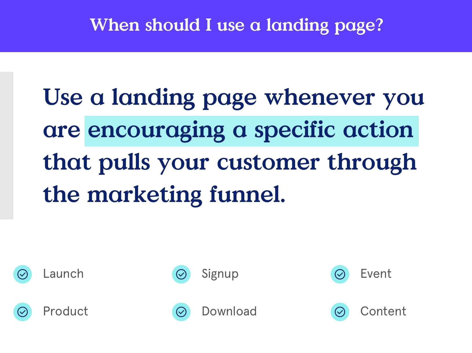
Whenever you’re encouraging a specific action that pulls your customer through the marketing funnel. When you can pinpoint the exact specific action you want your audience to take—such as download this e-book, subscribe to this e-newsletter, sign up for this coupon code—you should use a landing page.
When it comes to incorporating a landing page into your marketing campaign, if you’re trying to move people along their journey and into the next stage of your sales funnel, a landing page should be your tool of choice. Or when you’re looking to:
- Generate leads: Offer a free e-book; sign up for a free consultation; enroll customers in an e-newsletter.
- Encourage a purchase: Promote a product launch; share a sale or promotion; offer a printable coupon.
- Nurture a relationship: Encourage signups for a live or digital event; book an appointment; contact your business via phone or chat.
Do landing pages actually work?
Yes, they do! As a general rule across the board, landing pages have conversion rates that are 2 to 10 times higher than the average webpage. And get this: small businesses with more than 10 are able to grow their email lists twice as fast. How is this possible? Because these pages have a single goal: receive web traffic and compel visitors to take a single, specific action.
Unlike other web pages or websites, landing pages are unique tailors and narrowly focused on a specific action such as signing up for an e-newsletter, downloading a resource, making a purchase, or registering for an event. By having a single focus (and goal action) it’s possible for a landing page to deliver the right message to the right audience rather than talking about ‘all the things’ to ‘all the people’ and failing to persuade anyone.
What should be included in a landing page?
Think about it this way: it’s not what you include, it’s what you don’t include. Landing pages should be ultra-focused on one single point of conversion. Forget the extra lingo, jargon, and overabundance of flashy images. Instead, when it comes to creating an effective page, know that less is more.
At Leadpages, our professionally-designed templates take the guesswork out of effective marketing, so be sure to check out our landing pages. It’s also important for you to keep in mind these 5 essential elements:
- Unique Selling Proposition (USP): Your USP should be evident throughout your page, but it should make its primary debut in the headline and supporting headline. The headline tells a visitor why they’re on the page and gives them the extra nudge they need to keep reading. You’re looking to pique their curiosity and make them desire whatever you’re offering.
- Your offer—make it too good to pass up. The details of your offer should (ideally) combine both features and benefits such as a benefit statement, bulleted lists, and/or descriptive summaries. Successful offers are easy to understand, tailored to a unique audience, and can be expressed in both features and benefits.
- Visuals (imagery and graphics): From the hero image that headlines the page to videos and iconography, any multimedia you include should provide context and compel a visitor to take action. Resist the urge to clutter or introduce too much variety and instead focus on minimalism and a clean design.
- Call to action (CTA): Your call to action is typically in the form of a button placed (at least once) on the page, guiding visitors towards an opt-in form. It’s important to be specific with your language, be concise (it’s a button, not a novella), and include a high-contrast color to ensure your CTA button stands out.
- Supporting evidence (social proof): Increase your trust factor and further persuade your audience by including testimonials, reviews, social signals, trust seals, and awards. You want to reassure the visitor that what you’re selling is worth the opt-in or purchase.
How much do landing pages cost?
The cost varies, depending on how you create them and the tools and type of builder that you choose. Unlike other digital marketing platforms, Leadpages doesn’t limit the amount of landing pages you create or charge you more based on how much traffic you receive or how many leads you collect.
What will I learn in The Guide to Landing Pages?
Whether you’re running an ad on social media or announcing a promo on your website, it’s important to be strategic about which pages you create and how you create them.
This guide is designed to cover the ‘must-know’ fundamentals of landing pages as well as the most important tips and savvy strategies that have proven to work across hundreds of thousands of businesses. We’ll start with the very basics and make our way down to the nitty-gritty elements of effective copywriting and design.
We’ll cover topics such as:
The basics: What a landing page is (and what a landing page is not), why it’s essential for your business to have landing pages, when they should be used, how they work, and we’ll explore the different types of pages.
Creative content: Essential elements and why they matter in your marketing campaigns, copywriting tips, design, and how to create a landing page.
Optimization: Best practices, tests to run to ensure your page is performing to its full potential, how to promote your page so that it increases conversions for your business, and a 101 guide to lead magnets.
What is a Landing Page?
Landing pages are standalone webpages with one mission: to prompt visitors to take a single ‘next action.’ Here’s how they fit into your digital marketing.
Landing pages work systematically to transform cold traffic into leads, leads into customers, and customers into raving fans. How? By inviting visitors to make a decision: click (and convert) or hit the road.
That single decision can be practically anything: sign up for an email newsletter, register for an upcoming event, make a purchase, or download freebie content (or lead magnet). This point of decision is the point of conversion. As a result, your landing pages’ ability to convert can either catapult your business to the next level or hinder your hustle in a big way.
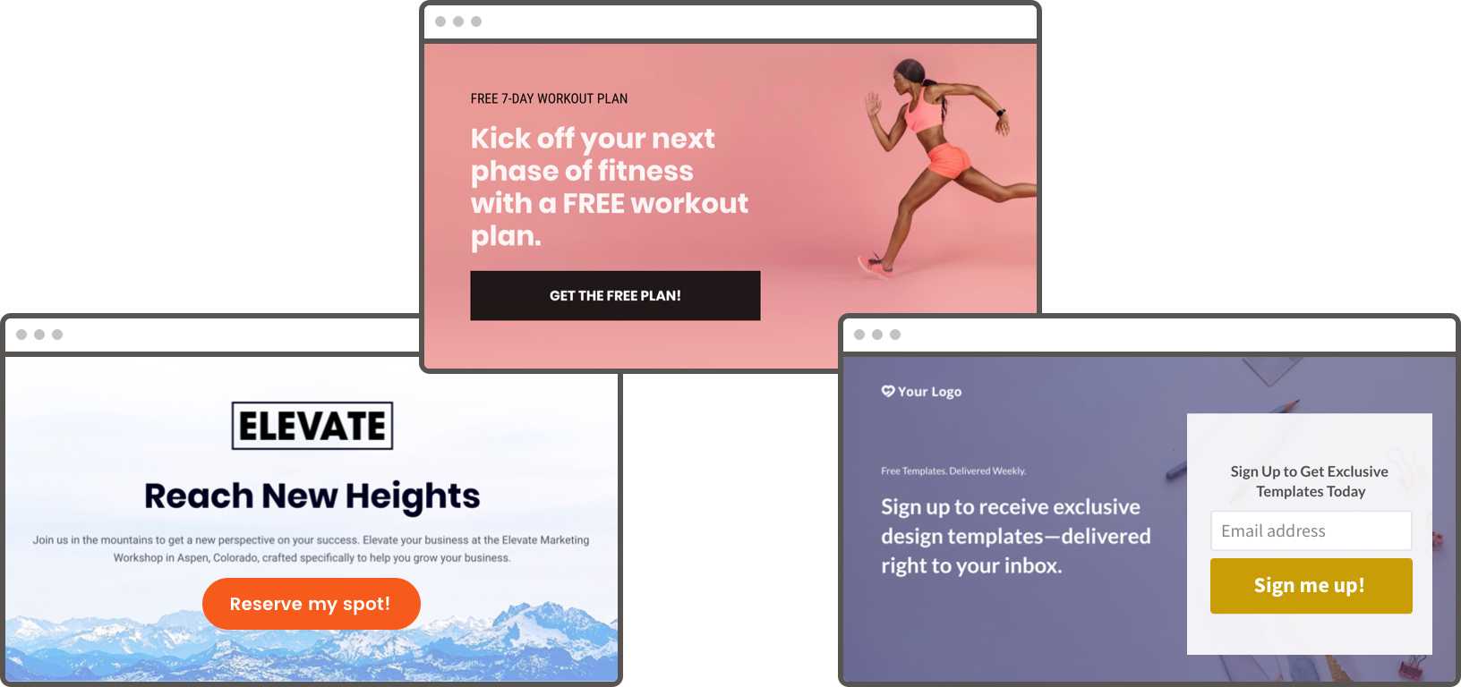
What’s the purpose of a landing page?
Wherever your web traffic comes from—whether a paid Facebook ad, social media post, blog article, or email—when people ‘land’ on your landing page, they should be met with enough persuasive and educational information to compel them to click and convert.
What is the difference between a landing page and a website?
Unlike static webpages or regularly published blog articles, landing pages are the lone rangers of your digital sales force: they do all the heavy lifting without linking to other pages or platforms.
Landing pages are typically not connected to other parts of your website or listed on your primary navigation menu (though there are exceptions). Instead, they are often sandwiched between an ad and a thank-you page as part of a digital marketing campaign.
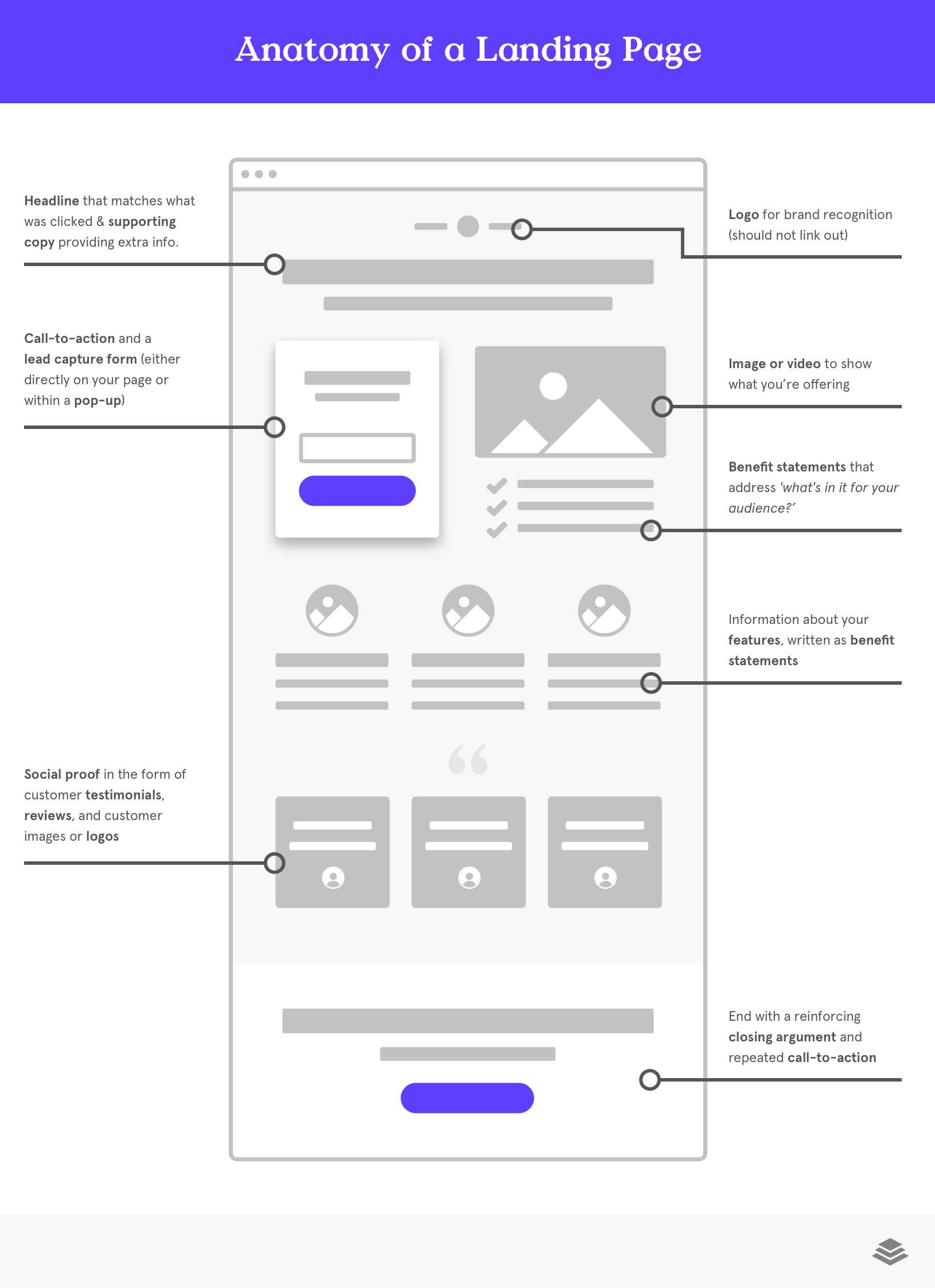
Anatomy of a Landing Page
- Headline that matches what was clicked and supporting copy providing additional information
- Logo for brand recognition
- Image or videor to show what you’re offering
- Call-to-action and a lead capture form (either directly on your landing page or within a pop-up)
- Benefit statements that address ‘what’s in it for your audience’?
- Description of your features
- Social proof in the form of customer testimonials, reviews, and customer images or logos
- Reinforcing closing argument and repeated call-to-action
In most cases, landing pages have one strong call to action that converts new prospects to “warm” leads (by collecting email addresses), or closing sales and collecting payments.
In either case, your landing page’s conversion rate is the percentage of visitors that make it over the finish line and take the ‘next action’ that you hoped they’d take (people that took the action divided by the total number of people who saw the page).
So, all in all, if you’re wondering, “what is a landing page used for?” – it’s used to convert web traffic. (It really is that simple).
Is a landing page right for your campaign? Find out why you need landing pages for the best lead generation and customer conversion.
What are landing pages used for?
Landing pages can be used for thousands of things—but only one thing at a time.
The one and only goal of a landing page is to convert. How you define that point of conversion is up to you. When determining how to use landing pages to meet your needs, there’s only one thing to remember. Each landing page needs a clear goal and single call to action.
The two most common landing page goals are:
- Collect qualified leads (typically via email address)
- Sell products/services to prospects and existing customers
What are some landing page examples?
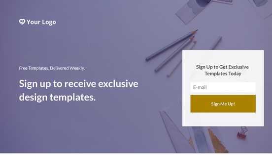
1) Lead generation Landing pages
Driving anonymous web traffic to your webpage is just the first part of the equation. By capturing the name and email address of your prospective customer, you’re able to proactively reach out and nurture your new lead until he or she is ready to buy.
By building your email list and collecting qualified leads, landing pages enable you to feed your marketing funnel and grow your business.
2) Sales pages
Sales pages are a particular kind of landing page that are solely dedicated to selling a product or service and collecting revenue. Ideally, sales pages are used to transform warm leads into customers and customers into repeat buyers.
The length of your sales page is typically determined by the price point, your audience’s familiarity with your offer, and the complexity of the offer itself. The more familiar your audience is with your offer and the lower the barriers to purchase, the shorter your sales page can be.
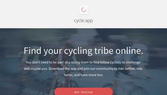
Learn more about the types of landing pages and their objectives here.
When it’s time for action, use a call to action
The purpose of a landing page is to generate leads and nurture your audience throughout their customer journey. Those landing pages that convert most consistently are ones that use a clear, compelling call to action.
Common landing page calls to action include:
- Subscribe to a newsletter, blog, or email list
- Download a piece of content, ebook, comprehensive guide, or white pages report
- Register for live or digital events, such as a webinar or conference
- Purchase a product or service
The call to action on your landing page depends on the end result you want from the funnel. Click to find out when to use a landing page in your marketing campaigns to reach your key business objectives.
Are you wondering: how can I create a landing page?
Create a high-converting landing page in a few simple steps!
- Start with an expert-designed landing page template
- Name your landing page
- Customize your page with your unique branding and content
- Include a powerful call-to-action
- Preview your page for multiple device sizes
- Prepare your page with SEO setttings (meta description and title) as well as social open graph.
- Publish your page
- Watch the leads roll in!
Make landing pages work for you
Let’s look at a basic example of how to use landing pages to generate leads.
Most small businesses begin by attracting web traffic through a social media campaign, a paid advertisement, or even a link on a guest blog post—all of which point to a landing page. Visitors click through an advertisement and land on your page, where they are then invited to take a next action. If you’ve done your job right and used effective landing page software, the copy and design of your page will convince them of the value of your offer and compel them to click and convert.
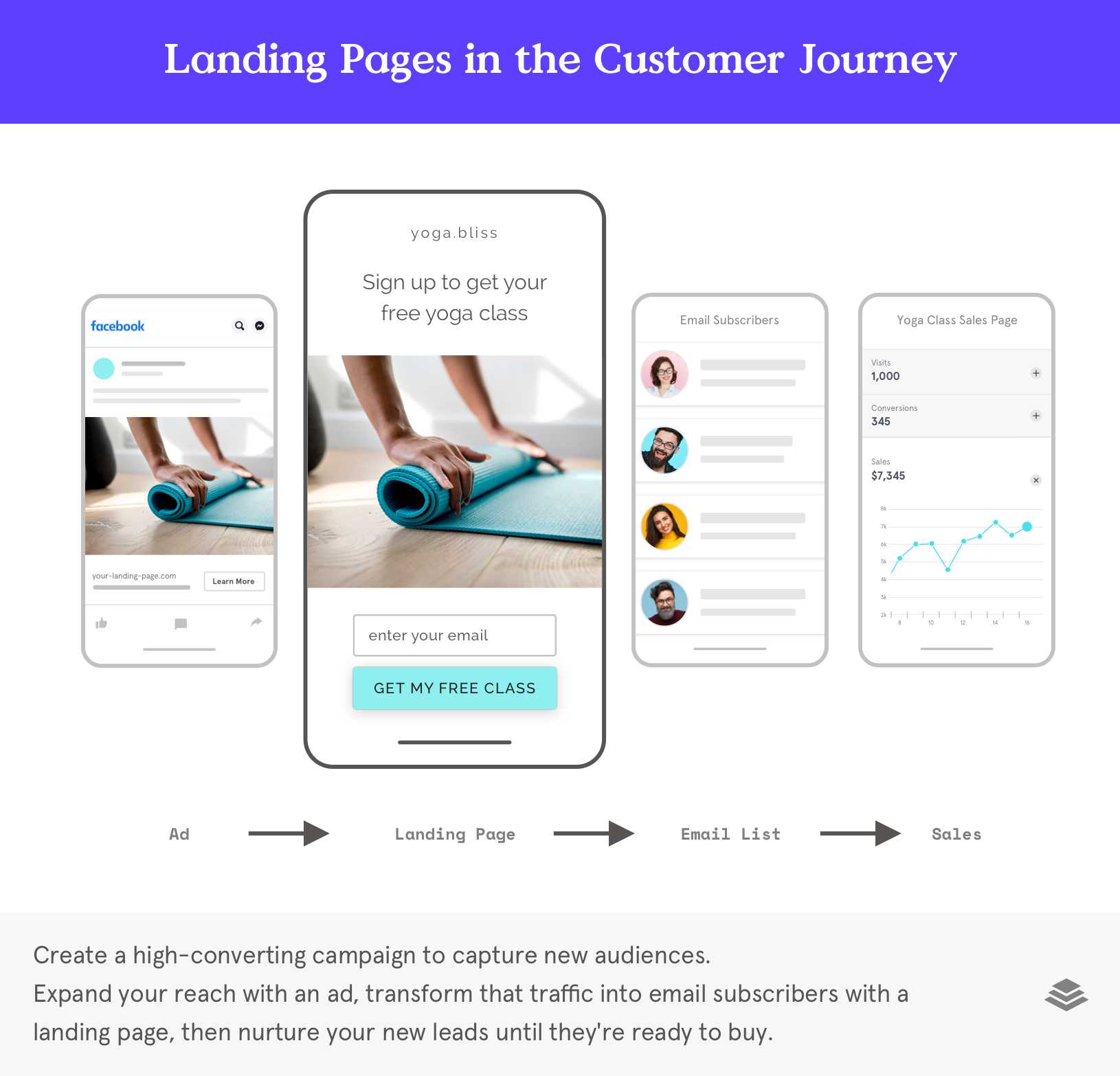
Landing Pages Along the Customer Journey
In the case of a lead generating landing page, a visitor might opt in to receive a free PDF or register for a webinar. In exchange for your free content, you get a name and email address to add to your database so you can follow-up with future marketing offers.
See an in-depth depiction of how landing pages work here.
Bottom line: No more wondering, “What is a landing page?” or “what are landing pages used for?” In essence, landing pages are simply the most effective marketing tool to turn traffic into leads and leads into customers.
Why do I need landing pages?
A website is simply not enough. You need landing pages to engage the right audience and compel them to a defined call to action: click, sign-up, buy now!
Sending your hard-won web traffic to an under-optimized, generic, static page is one of the best ways to waste your time and money. That’s where an optimized landing page comes in.
Why do you need landing pages for your marketing?
Because landing pages are designed to convert, one of the key advantages of landing pages is their ability to bring traffic to the next stage of the sales funnel. No other webpage has this kind of targeted approach, which means landing pages can truly be your digital marketing lifesaver.
What are the advantages of using landing pages in your marketing strategy?
1. Use landing pages to reach your goals
As a business owner, you likely have specific goals that you’re trying to achieve with certain measurements (metrics) that indicate whether or not you’re on track. Perhaps you need to generate a certain number of new customers in the next month, or launch a new product and reach your sales targets.
By dedicating a landing page to a specific conversion goal with a laser-focused call to action, you’re able to easily concentrate your efforts, channel your traffic, and track your conversion rate.
Because landing pages are designed to convert, one of the key advantages of landing pages is their ability to bring traffic to the next stage of the sales funnel. No other webpage has this kind of targeted approach, which means landing pages can truly be your digital marketing lifesaver.
Need to generate more qualified leads? Your landing page will focus on email collection as your point of conversion. Selling a product or service online? Use a sales page to close the deal.
The landing page meaning and objective should directly align with your business’s goals to help you achieve the business growth you deserve.
2. Get more bang for your paid ad buck
Because landing pages strategically pair a targeted audience with a customized offer and message, they pack a persuasive punch that pays off in a big way. One of the key advantages of landing pages is that you’re employing paid-for traffic in the most impactful way.
Whether you’re spending 5 hours a day on content marketing, $15 a day on Facebook ads, or $500 a day on Google advertising, you’re making an investment in your small business marketing—and you deserve the greatest possible return.
Directing your inbound web traffic to a static webpage is like putting on a blindfold and throwing darts at a wall, hoping that one will find its way to the bullseye. You’re throwing the darts in the right direction, but you’re not utilizing all of your resources to get the best possible result.
Landing pages—especially those that stem from professionally-architected landing page templates—are designed to convert, which means they’ll be a much more efficient and effective use of your paid traffic.
3. Personalizing and progressing your customer relationships
Because landing pages are versatile enough to be used at various touchpoints along a customer journey—from offering an initial lead magnet to selling your highest priced service package—they are essential elements of your marketing and sales strategy. But they work even better when they’re personalized. The purpose of a landing page is to connect with your audience on a deeper level and customized landing pages do a stellar job building this connection.
When properly customized to a specific target audience and relevant offer (which is one of the most important landing pages best practices), landing pages meet a visitor wherever he or she is within your customer journey. With the help of customized landing page design and copywriting, you can progress your customer relationships effectively and at scale.
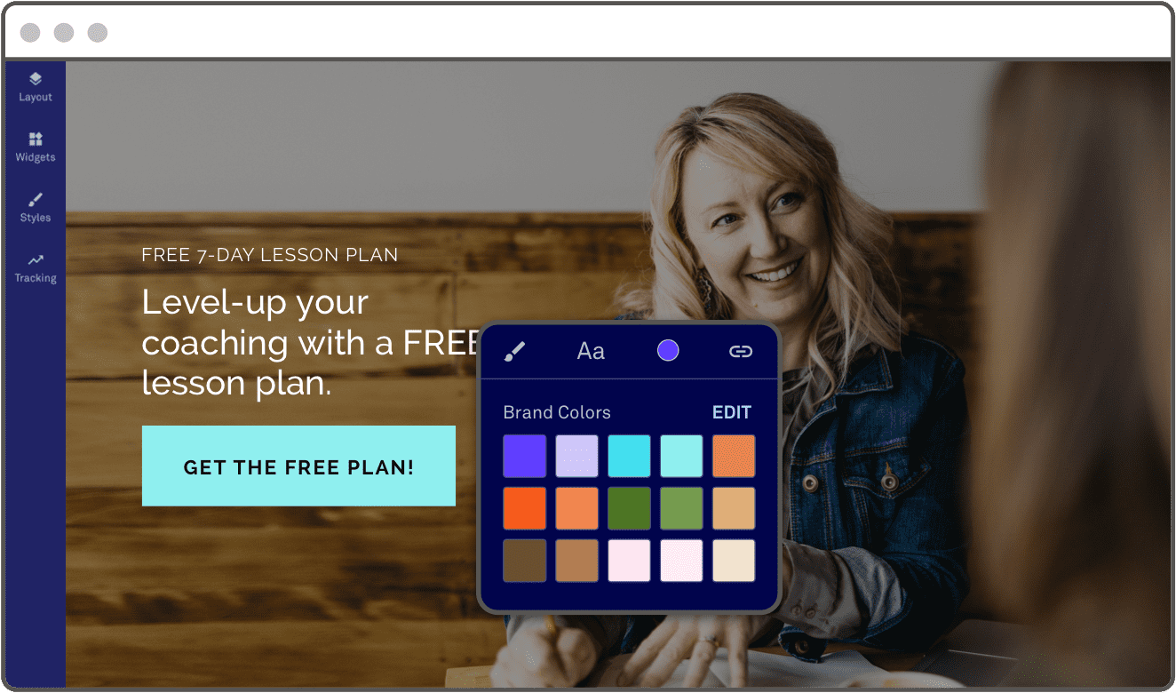

Not to mention that they’re also excellent at positioning and building your brand equity. A well-crafted landing page with consistent art and copy exhibits professionalism. Include a little social proof in the form of testimonials and reviews, and you begin to build credibility in the eyes of your community.
Bottom line: The purpose of a landing page is to transform traffic into leads and leads into customers. Consider using a landing page builder like Leadpages to get the most out of your paid advertising and advance your audience along their customer journey.
When should I use a landing page?
What is the purpose of a landing page?
Whether you’re sending emails, posting on social media, blogging, or buying ads, landing pages have limitless possibilities for growing your business.
Whether you’re sending emails, posting on social media, blogging, or buying ads, landing pages have limitless possibilities for growing your business.
A well-optimized landing page is the single best way to get the greatest possible return from any inbound marketing campaign.
Because landing pages are carefully tailored to a specific target audience and are unique to each offer, they deliver value in a way your website simply can’t. Static websites simply aren’t equipped to deliver different messages to different audience segments. That’s why a landing page is important for your marketing: it emphasizes action where other webpages don’t.
Nothing is more persuasive than a personalized experience, which is why we often recommend marketers create a landing page for every launch, product, event, signup, or piece of content that they create.
10 Landing page examples and uses:
- To increase your return on digital advertising or PPC campaigns
- To tailor your messaging to a variety of unique digital campaigns
- To encourage people to sign up or pre-register for events (both online and off)
- To collect subscribers to your email newsletter
- To promote a product or the sale of a unique service
- To offer a discount coupon or promo code in exchange for an email address
- To offer more detailed information on a long-form sales page
- To personalize your social media profile links with a special offer
- To invite visitors to download a free digital resource or unlock free digital content
- To link to from a guest blog post (author bio box)
When should you use a landing page in your marketing campaigns?
Whether you’re driving traffic from a pay-per-click (PPC) ad, email, social media, or organic content, if you’re trying to move people to the next stage in your sales funnel—a landing page is likely the best tool to do the job. A good rule of thumb when to use landing pages: if you can measure the action your customers are taking, you’ll likely want a landing page to compel that action.
Think about the goal of your marketing campaign. Boil it down to a single objective or call to action. That exact moment—the moment of action—is where your landing page should come in. The strong capacity to convert for a single action is why a landing page is important for your overall marketing strategy.
Examples of when to use landing pages:
- Generate leads
- Offer a free ebook or other downloadable content
- Sign up for a free consultation
- Enroll people in an email newsletter
- Encourage a purchase
- Promote a new product launch
- Share a sale or promotion for a product/service/bundle
- Give a printable coupon or pass for in-person storefront/event
- Nurture a relationship
- Reserve a table or book an appointment
- Contact you via phone or chat
- Encourage signups for a live or digital event
Learn how to create a landing page (and see awesome landing page examples) that fits each of these key objectives.
You’ll know when to use landing pages for the right audience based on your offer (lead magnet) and initial source of traffic:
- By offer type: Every offer won’t be right for everyone. Treat your prospects and leads to content that’s suited to their early stage of the funnel, while inviting your customers to engage in content or promotions that are exclusive to your inner-most community.
- By traffic source: Each digital channel is distinct and the traffic you drive from your Facebook page will behave differently than the traffic you get from a Google ad. Easily tailor your message (match it to your ad) and track your return by creating a unique page for each channel source.
Even landing pages have their limits: when not to use them
By now you know that landing pages are designed with a singular call to action in mind—but what about when you have several different audience groups and several different actions? In these cases, you’ll still want to optimize your page but won’t necessarily rely on a landing page to get the job done.
Consider your ‘About’ page or ‘Contact Me’ page, for example. Rather than compelling a visitor to take action, these pages are meant to inform or educate. Your About page exists primarily to emphasize your brand’s history, mission, and team. Even if you include a call to action on these pages, the main point is the information, not the action.
Rather than turning every page into a landing page, turn the informational webpages into traffic sources. These sources can then direct visitors to key landing page websites that do promote a specific call to action and pull the visitor to the next step of your funnel.
Bottom line: You’ll know when to use a landing page whenever you are encouraging a specific action that pulls your customer through the marketing funnel.
What is the difference between a home page and a landing page?
Unlike a home page or a primary business website, landing pages are tasked with a highly unique (and uniquely important mission): to convince a visitor to take action (to sign up, download, buy, etc.).
Are landing pages necessary?
If you’re encouraging a specific audience to take a specific action that advances them through your customer journey — that’s when to use a landing page.
How do landing pages work?
Landing pages have one goal only: to convert web traffic. That means every element on the page has to pull visitors towards a single call to action.
The mechanics of a landing page are simple: creating a cohesive journey from click to conversion. How do landing pages work? Here’s what you need to know.
Because landing pages have one goal and one goal only—to convert web traffic—every element on the page has to pull visitors towards a single call to action.
Landing pages that convert best do so because of the combination of layout, headlines and supporting text, and related images.
Before you dive into crafting a page, it’s important to understand your landing pages as a game of give and take—particularly in the primary case of lead generation. In order to collect a visitor’s email address, you’ll have to earn it by offering value in exchange. Sales pages—a special category of landing pages—are focused on closing the deal, but the formula is similar in order to drive revenue.
If your offer is enticing enough, visitor’s will willingly exchange their email address (or their money) for access.
Why are landing pages effective?
A landing page works significantly better for lead generation than a website does because landing pages are specifically made to get visitors to take action.
When comparing the use of a landing page vs. homepage, you’ll see that landing pages focus on conversion (taking action) while webpages focus on providing information.
Whereas a website tries to address all the questions of all the different audiences that could possibly visit the site, the best landing pages that convert do so because they only contain content that relates to a narrow topic for a narrow segment of the larger audience.
This results in the individual visitor to a landing page feeling closely connected to what they see on the landing page, instead of having difficulty seeing how the information of a website is relevant to them.
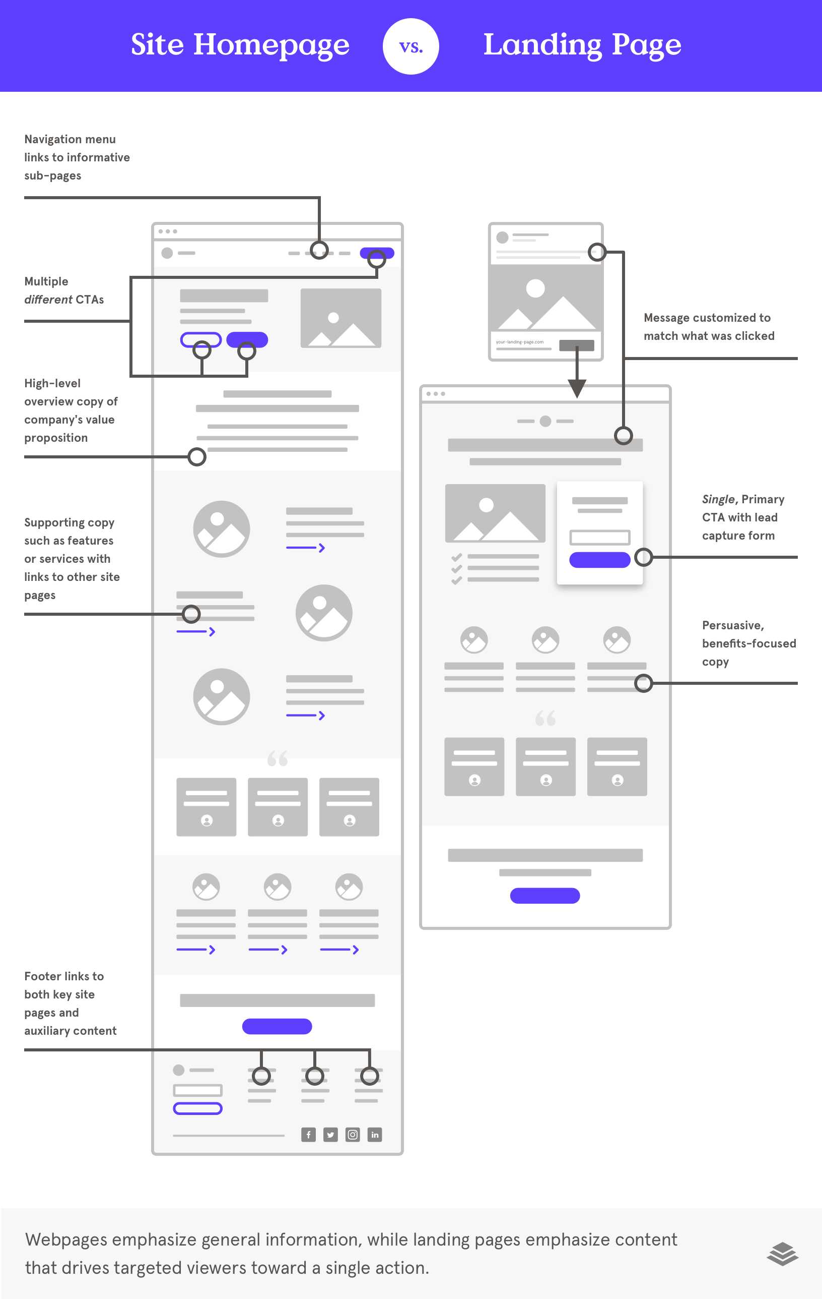
So how do landing pages work? What does a landing page actually do from start to finish?
The Mechanics of Conversion: how does a landing page work?
The best way to understand the power of a landing page is to put yourself in the position of the people you hope to convert into prospects and clients.
Let’s imagine you need to generate leads and in exchange for an email address, you’re giving away a free online training course.
Here’s what this part of your customer journey might look like:
- An advertisement catches your prospect’s attention.
- She clicks the ad.
- She lands on your page.
- She reads your benefit-driven headline and wants more.
- She finds your offer to be simply irresistible.
- She clicks your call-to-action button.
- She fills out your opt-in form.
- She’s on your email list as a qualified lead.
The email opt-in form captures the contact information you need to then meaningfully follow-up with your new lead and nurture the relationship until she’s ready to make a purchase.
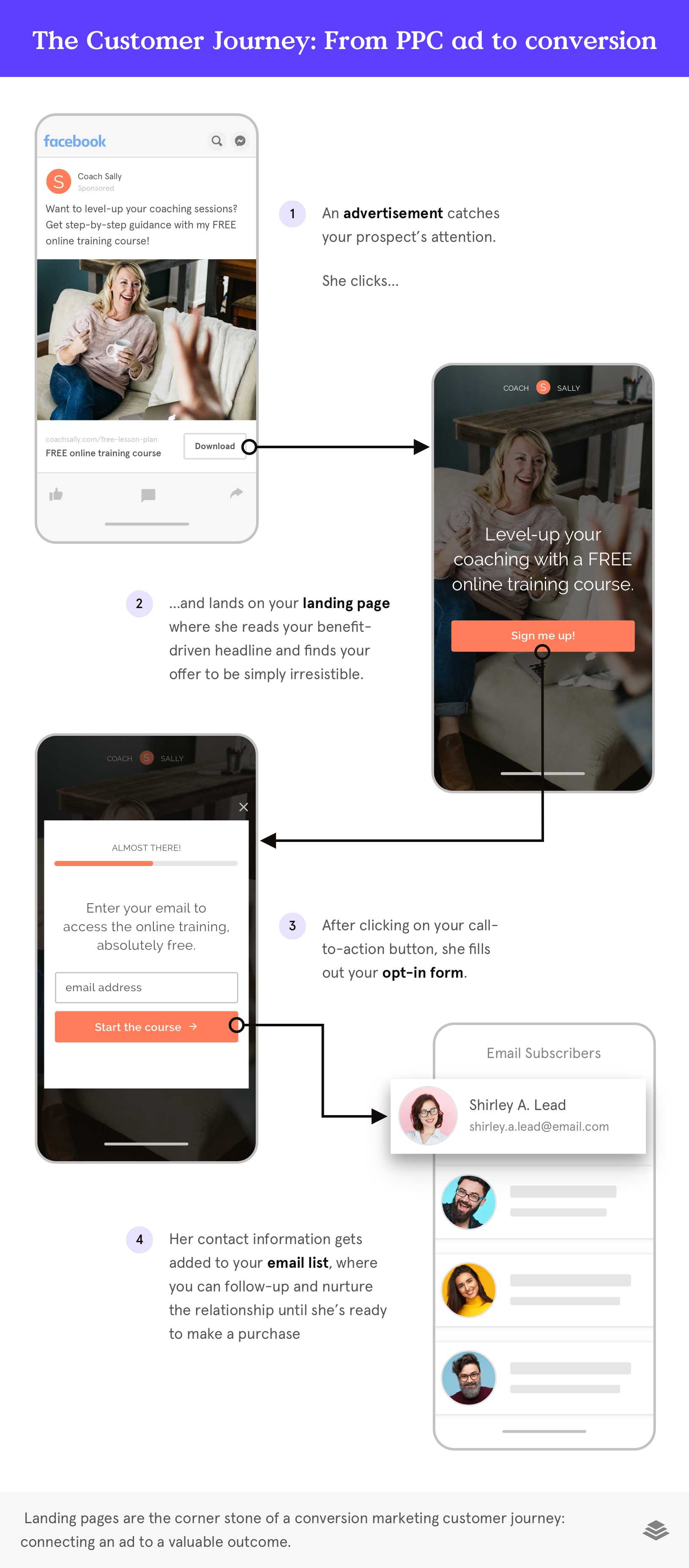
That’s it! Landing pages really are that simple! With the right software and landing page builder, you just need to customize the design of your landing page, write compelling copy, and let the high-converting template do the rest to gather and store the information. See our landing page best practices to get the scoop on creating high quality landing pages that convert.
Use conversion-tested landing page templates to get a head start
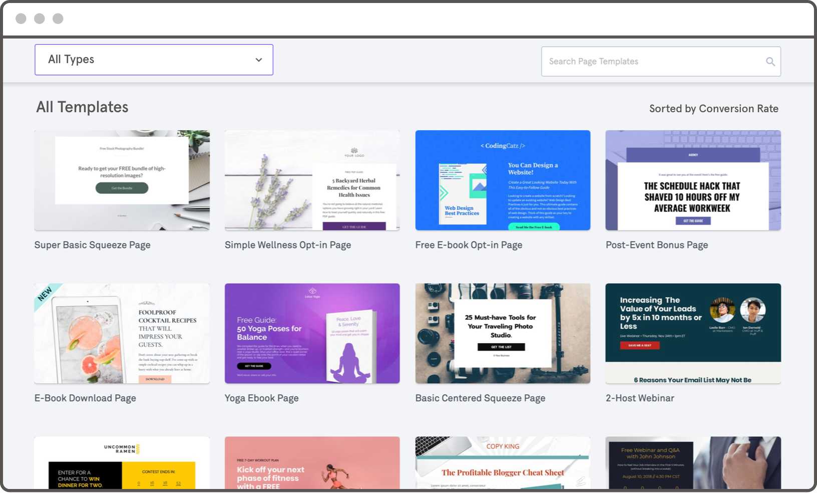
Because our landing page templates are engineered to be high-converting, and they’re pre-sorted by conversion rate, you can have the confidence that not only does your landing page look good, but it’s also going to turn visitors into qualified leads and customers.
How many landing pages should a website have?
Your website should have as many landing pages as needed for the currently active marketing campaigns you’re running. For some businesses, this will mean one to three landing pages will be enough. For others, hundreds of pages that address different marketing objectives for specific audience segments may be needed.
How many landing pages a website should have is simply a factor of time and opportunity. But at a minimum, every business should have at least one landing page focused on converting traffic into qualified leads with a compelling message that matches the needs of the target audience.
Bottom line: How do landing pages work? By building an exchange of value between your visitor and your business. They are customized to each audience (traffic source) and marketing campaign, which makes them far more compelling and high-converting than a static webpage. And they contain the mechanisms (call-to-action buttons and/or lead collection forms) to turn visitors into email subscribers.
Types of Landing Pages
Landing pages typically fall into three main categories, each with its own unique strengths and strategies: splash pages, squeeze pages, and sales pages. A single marketing campaign may include one or multiple types of landing pages, depending on the calls to action that move a visitor forward.
Let’s go through a few landing page examples to debunk how and when you should be using these types of landing page templates for your marketing.
That single decision can be practically anything: sign up for an email newsletter, register for an upcoming event, make a purchase, or download freebie content (or lead magnet). This point of decision is the point of conversion. As a result, your landing pages’ ability to convert can either catapult your business to the next level or hinder your hustle in a big way.
Make a splash (page)
A splash page is an introductory page that customers typically see before diving into the primary content of your website. Also called splash screens or welcome gates, these pages ‘welcome’ the visitor immediately upon arrival. They can appear as standalone pages or full-screen pop-ups when a visitor is about to land on your website (homepage, blog, etc).
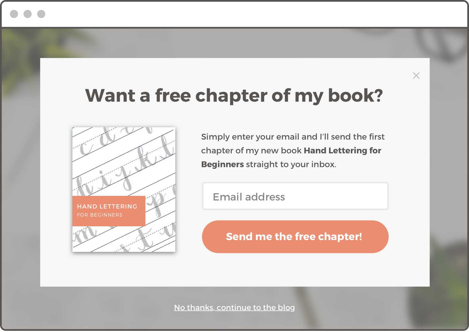
Splash pages are extremely popular and effective in capturing a visitor’s attention and generating leads at key touchpoints. They’re popular landing page examples because they do the heavy lifting to attract your prospect before they even hit the main page.
Splash pages are often the first or second impression someone has with your brand, so you may include a low-cost ‘ask’ with a high reward. For example, first-time visitors are more likely to give their email addresses in exchange for a free ebook, but less likely to opt into a $200 training program without prior experience of your brand.
The right way to use a splash page
The objective of a splash page is (typically) to collect leads. It usually does this by providing initial information about the brand paired with a direct, low-barrier call to action.
Splash pages usually have three parts: engaging header, call to action, and exit button.
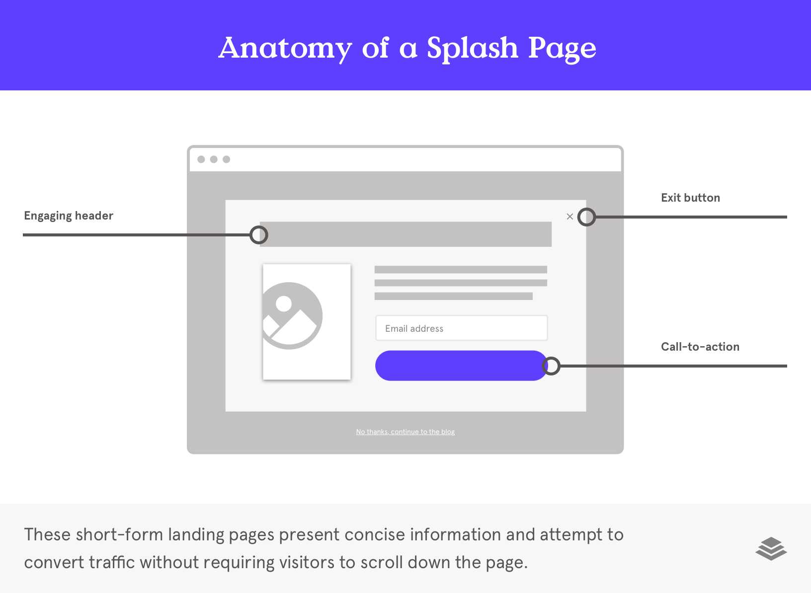
Let’s take some landing page inspiration with an example. Let’s imagine that a visitor found your yoga-related blog on Google. They click on it, and they’re about to land on that blog post when the splash screen pops up first. The splash screen is offering a free downloadable ebook “The Ultimate Guide to Your At-Home Yoga Practice.”
You can assume that your visitors are already interested in yoga because they clicked on the blog, so you know that this free content would also be relevant to them. This pre-qualified interest means the visitor is more likely to input their email address to receive the free ebook, even though it’s one of their first touchpoints with your brand.
If they’re not interested, though, they might click on the button on the bottom that reads, “No, I’m not interested in being stronger and healthier…” and continue on their way—no worse for wear. They’ll still have access to the blog post (where you’ll then have more opportunities to convert them into a lead).
The scoop on squeeze pages
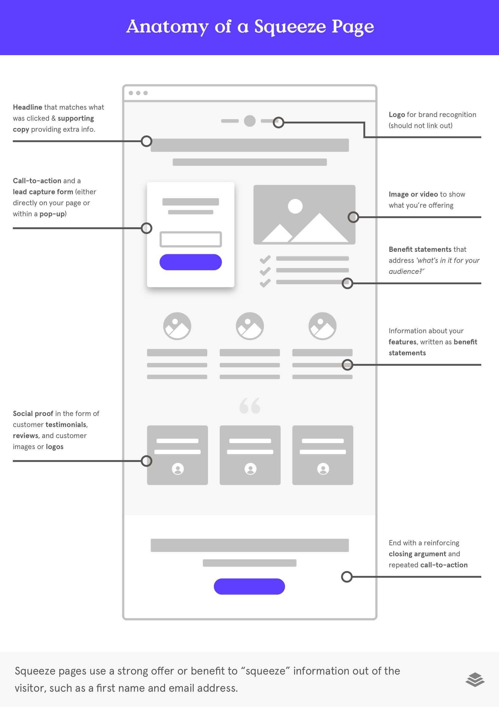
Squeeze pages, sometimes called a lead capture page, are the most common types of landing pages. They’re designed to “squeeze” information out of the visitor such as a first name and email address.
How to craft a squeeze page
Squeeze pages vary in content, length, and design depending on the page’s objective and call to action. They will also differ based on where the visitor is within their customer journey. Most often, a squeeze page will include the following components:
- Powerhouse headline
- Descriptive offer
- Compelling call to action
- Opt-in form
- Testimonials and social proof
- Supportive imagery/videos
Learn the essentials for creating a successful landing page here.
Close the sales (page)
While splash and squeeze pages are designed to generate leads and collect emails, sales pages focus on making sales (cha-ching!). This means that while splash pages and squeeze pages are typically directed at new prospects, cold traffic, or visitors, sales pages usually target warm leads that have already engaged with your brand to some degree.
How to use a sales page
Because the objective is to make a sale, the page’s persuasive copywriting and content should focus on the benefits of the product or service, the lifestyle of the brand, and the offer or discount.
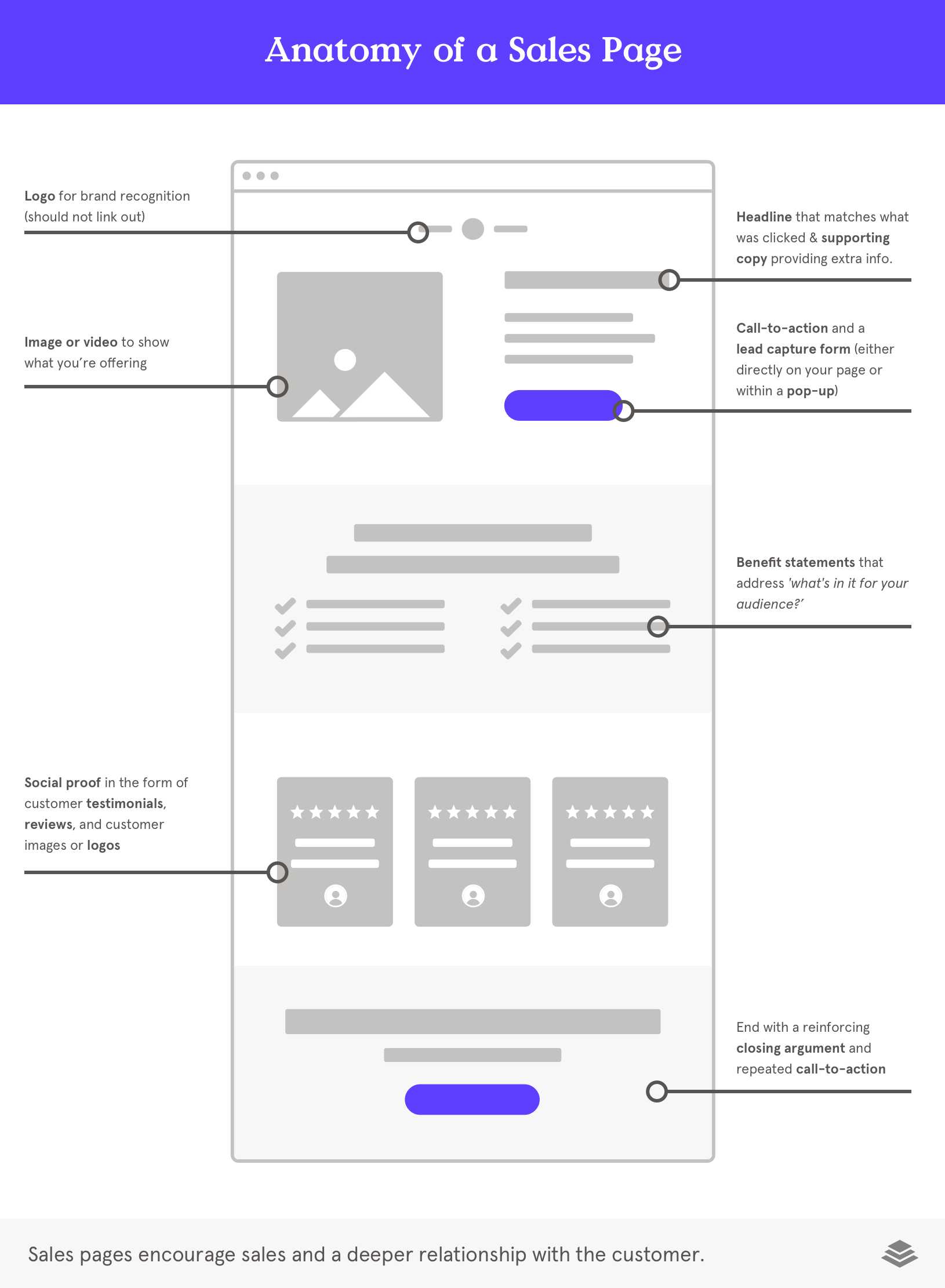
Although you’ll usually use sales pages with people you’ve already built a relationship with, you can still use sales pages with new visitors if designed appropriately. Because sales pages are high-stakes revenue-generators, don’t be afraid to test different headers, offers, and CTAs until you see the conversion rate you want. Find other landing page best practices here.
Bottom line: Splash pages collect emails before a new visitor lands on your website. Squeeze pages generate new leads with a strong offer or benefit. Sales pages encourage sales and a deeper relationship with the customer. It’s time to use these landing page examples to launch your own effective marketing campaign.
Essential landing page elements
What should you put on your landing page? Keep your content laser-focused on a single point of conversion and strip everything else away.
If you find you’re trying to include too much, that could be a tell-tale sign that your audience and offer may not be an ideal match. Make landing pages that convert by understanding and including the essential elements. Get the free Guide to Landing Pages by Leadpages and start building.
You know what a landing page is and you know why they matter within your marketing campaigns… but what should you actually put on your landing page? What does an optimized landing page look like?
It’s not what you include—it’s what you don’t include. For best results, keep your landing page laser-focused on a single point of conversion and strip everything else away. If you find you’re trying to include too much, that could be a tell-tale sign that your audience and offer may not be an ideal match.
Two landing pages rarely ever look the same, but they’re often made of the same set of basic ingredients. Here’s what to include on a landing page if you want to see the success your business deserves:
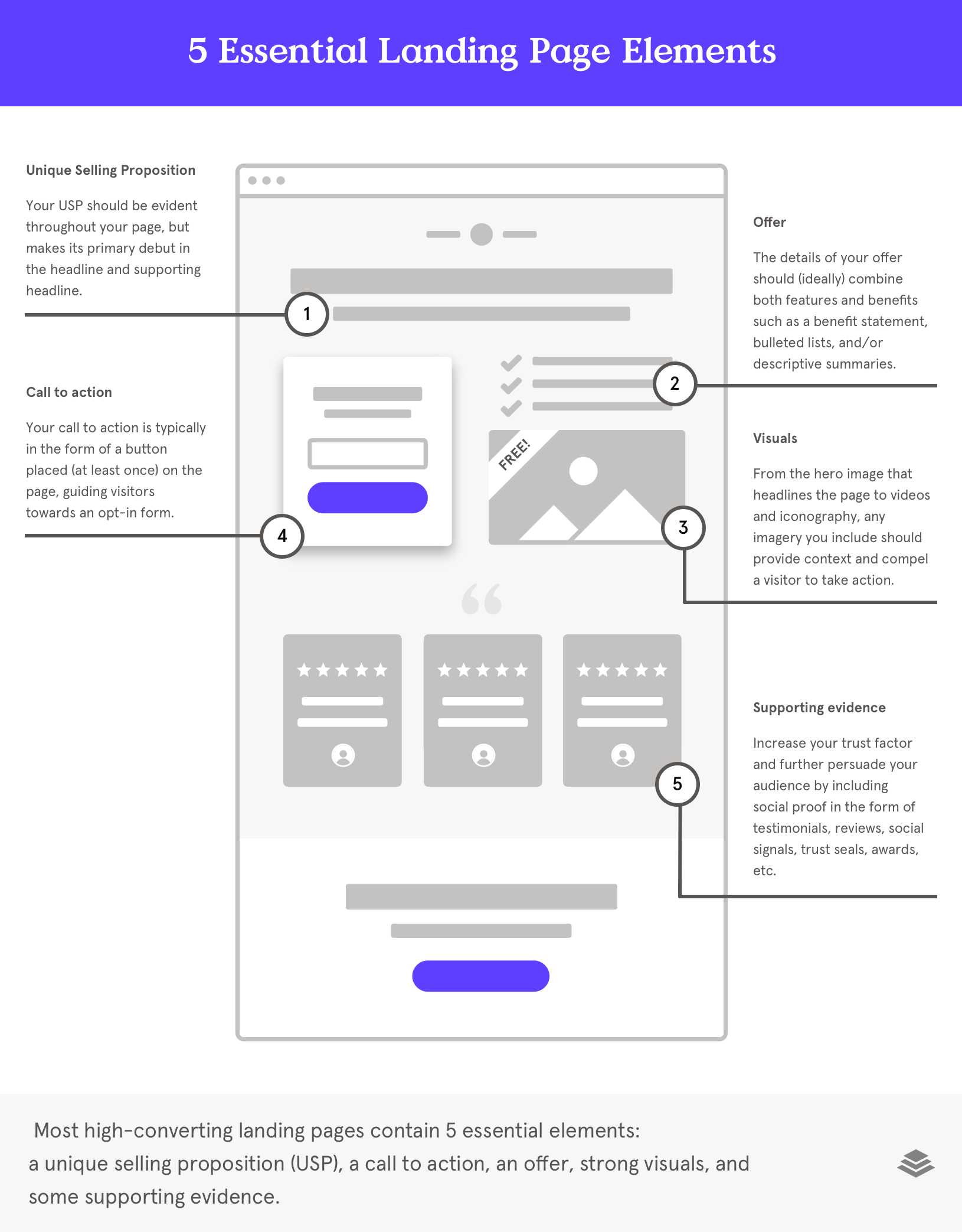
- Unique Selling Proposition (USP)
Your USP should be evident throughout your page, but makes its primary debut in the headline and supporting headline. - Your offer
The details of your offer should (ideally) combine both features and benefits such as a benefit statement, bulleted lists, and/or descriptive summaries. - Visuals (imagery & graphics)
From the hero image that headlines the page to videos and iconography, any multimedia you include should provide context and compel a visitor to take action. - Call to action (CTA)
Your call to action is typically in the form of a button placed (at least once) on the page, guiding visitors towards an opt-in form. - Supporting evidence (social proof)
Increase your trust factor and further persuade your audience by including testimonials, reviews, social signals, trust seals, awards, etc.
Once you master these basic elements and understand the strategy behind each of them, you can confidently construct the perfect landing pages for any and every campaign. So let’s get into what to include on a landing page to start making crazy conversions!
1. Your USP: Putting the benefit in big bold letters
The headline is the first impression customers will have with your landing page, so make it a good one. Your landing page headline tells visitors why they’re on the page and gives them a reason to keep reading. It invites them to learn more about what you have to offer. And this invitation can make or break your ability to convert.
Your headline should work in two ways: 1) pique the curiosity of the visitor so they’ll be engaged and interested, and 2) make them instantly want what you’re offering.
You want to do this by stimulating an emotional response with your headline. In most cases, the best way to spur emotion on your landing pages is by describing the customer’s pain point or pointing them towards a positive future vision.
For example, let’s imagine that you sell yoga clothes made from bamboo and your audience loves eco-friendly workout clothes. The headline should then emphasize this key benefit while also engaging them.
Here are some not-so-great examples:
- Bamboo Leggings Made For You
- Eco-Friendly Workout Clothes
Here’s a better example:
- Bamboo Leggings that Will Save Your Wardrobe, Wallet, and World
The second example demonstrates the product’s top selling points in a meaningful, concise way that is customer-centric (not product-centric).
Learn how to create an engaging headline and write more compelling landing page copy here.
2. Your Offer: Make it too good to pass up
Landing pages are generally used to generate leads or sales. In both cases, the success of the page rides on the irresistibility of the offer.
Successful offers are those that:
- Are easy to understand
- Are tailored to a unique audience
- Can be expressed in both features and benefits
In the case of lead generation landing pages, most businesses offer a piece of freebie content, known as a “lead magnet” because it attracts (and magnetizes) potential leads. This strategy is one of the best ways to generate leads because you offer some sort of value in exchange for the customer’s contact info.
Before sending your lead magnet out into the wild, try infusing it with these three elements:
- Unexpectedly High Value: Because your lead magnet is often your first interaction with a new prospect, you have to over-deliver in value. Give more than your visitors expect to receive for free—and they won’t be able to resist clicking and converting.
- Specificity: Be as clear and specific as possible. If your visitors aren’t able to quickly understand (1) what you’re offering and (2) why it matters to them, they won’t take action.
- Urgency: Few things are as compelling as the fear of missing out. Layer in a sense of urgency or scarcity to encourage visitors to take action now, rather than waiting.
3. Your Visuals: Setting the scene
Landing page design is equal parts art and science. You want to both visually engage your audience while also creating a cohesive experience that carries them through the first click on an ad to the final close of a thank-you page.
Incorporating multimedia into your landing page—with video, graphics, icons, photography, and more—is an excellent way to support your offer and provide additional context or details. Some multimedia landing pages examples you can include:
- The hero shot should visually engage your audience and show context of use for your product or service (pulling back the curtain on the lifestyle of your brand).
- Iconography should be intuitive and meaningful.
- Photography/Imagery should enhance your visitor’s understanding of your offer and illustrate the primary benefit.
- Fonts should be consistent across your brand and should be kept to a minimum on landing pages (aim for no more than 2-3).
Creating a compelling visual experience requires that you resist the urge to clutter or introduce too much variety. Use a landing page creator that emphasizes minimalism and clean design.
Learn the specifics of creating beautiful landing page design here.
4. Your Conversion Goal: Bring it home with a powerhouse CTA
The goal of a landing page is to get your customer to take action: give an email, download an ebook, complete a purchase. This means you need a strong call to action that compels them to take this action. Visitors won’t know what to do next unless you make it clear.
A call to action (CTA) is usually a button where the visitor is directed to take that action.
Feel free to get creative with the language you use, but never at the expense of clarity.
For example, if you are offering a free guide in exchange for an email address, your CTA button might read: Yes, Send me the guide!
How to make a strong CTA button:
- Be specific Avoid generic CTA text such as ‘buy now’ or ‘submit.’ Instead, increase your conversion rate by speaking directly to your audience’s next action: ‘Start Learning French Today,’ for example.
- Be concise Keep it short and sweet. It’s a button. Not a paragraph.
- Include high-contrast The CTA button should be a bold color that contrasts the background so it will stand out. You might also consider making the CTA button bigger than the text around it.
Remember that the CTA button is where you officially making the conversion. Here, your visitors click and you collect. Optimizing the call to action button is critical to your landing page success. That’s why we highly recommend you perform A/B testing to ensure your CTA button is attracting clicks.
5. Your Supporting Evidence: Prove your worth
The best landing pages also include testimonials or reviews from former clients or users. These testimonials provide social proof that helps convince and convert your visitor. They reassure the visitor that what your selling is worth the opt-in or purchase. Including a section of real-life client reviews is the best way to make your landing page soar.
The perfect landing page isn’t just your business talking about how great it is-- it has real life customers and clients praising your value.
Bottom line: Don’t get bogged down when thinking about what to include on a landing page for your campaign. Focus on the following elements to see major success: an engaging headline, compelling offer, supportive imagery, powerhouse call to action, and reassuring testimonials.
Landing page copywriting
Copywriting for landing pages is equal parts art and science. Every word counts: from your headline, call-to-action button, to bulleted lists & more!
But how do you go about copywriting for landing pages?
The best place to begin is to choose the right message you want to share. Then break that message into the different written components that you’ll include on your page. We break this down step by step below to help you create the most effective content for landing pages on your site.
Choose the right message
In order to choose the right message, copywriters rely on identifying their target audience’s stage of awareness, identified as:
- Very Aware: Knows about your company and your offerings
- Product Aware: Knows solutions exist and they know your product is one of those solutions
- Solution Aware: Knows solutions to their problem exist
- Pain Aware: Know they have a problem but aren’t aware of solutions
- Unaware: Little sense of pain and no idea of solution
The length of your landing page will largely be determined by the reader’s state of awareness. Generally, the less aware the prospect, the more copy you write and vice versa.
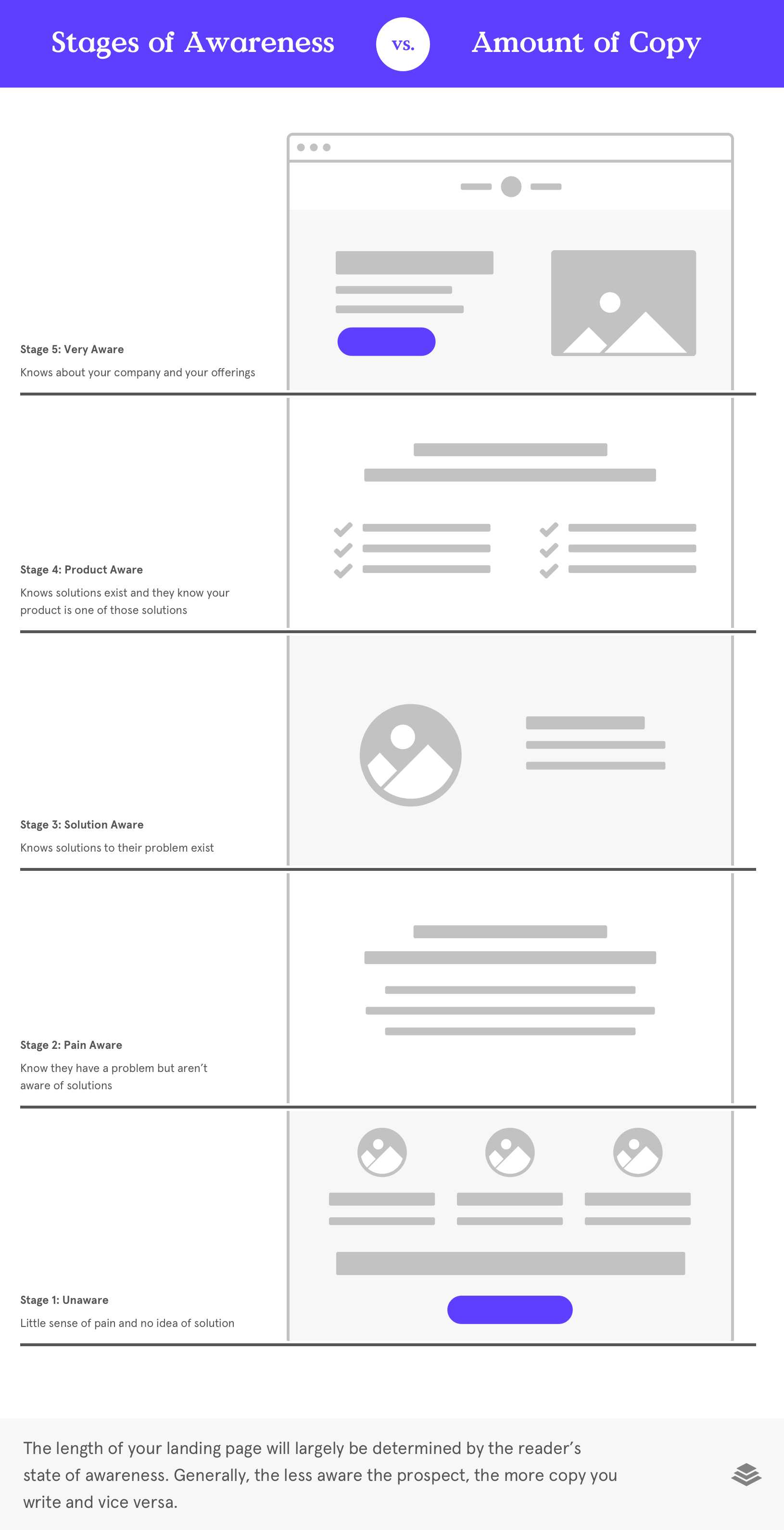
Consider that people make decisions for emotional reasons, but justify them with logic. You need—every time—to supply them with both.
Therefore, it stands to reason that the readers who know less—and are lower on the “awareness scale” —need more information to make a decision. Just think of it as catching them up to knowing as much as the Product Aware and Most Aware folks.
How will you know what stage your reader is in?
Start by looking at what drove a person to your landing page and which traffic source brought them to you.
Was it a Google ad for a branded keyword phrase? The reader is probably Product Aware or Most Aware. Was it an email for a new subscriber? The reader is probably not Product Aware or Most Aware. Was it a Facebook ad promising a webinar to solve a problem? The reader is probably Problem Aware or in the earliest stage of being Solution Aware.
Make your message evident across the page (in 3 simple steps)
Once you’ve clarified your audience’s stage of awareness and the message that’s most suited to that stage, you can use the following 3 simple steps to content for landing page that enhance their awareness start to finish.
- Entice with the headline
- Close with the CTA
- Sell with the rest
1. Entice with the headline
Your headline is one of the most important elements of your landing page. An engaging headline entices your customer to click through to your landing page, tells them what the page is about, and encourages them to keep reading.
So how do you create a captivating headline?
Here are 5 headline strategies that will help you engage your audience.
1. Ask My Question
Questions arouse curiosity, which innately draws your audience into the page. Ask the question that your customers are already wondering, or ask a question that they didn’t even know they needed to ask. Your lead magnet should be the answer to that question.
Example: Will You Lose 20 Pounds In 10 Weeks?
2. Tell Me How
The classic “how to” headline tells your audience that your lead magnet is going to provide a solution to a problem they’re having. This promises them some sort of value, which will make them want to keep reading to gain that value.
The “guide” formula is similar to this. You’re promising a solution to their problem by providing a guidebook or roadmap.
Example: Learn How to Lose 20 Pounds In 10 Weeks / The Ultimate Guide to Losing 20 Pounds In 10 Weeks
3. Show Me the Best
Consumers have choice. And it’s that choice that you’re going up against. They have to pick your product over your competitors’. So point out the difference and then show them why your lead magnet or product is the best solution.
Example: Why HIIT Is Better Than Cardio to Lose 20 Pounds
4. Make Me Feel
Emotions have power. In some cases, you’ll want to lead your audience to a rational conclusion. But when you want to compel your audience to take action—you’ll need to evoke an emotion.
Whether you opt for a fear-based headline or something a little more aspirational, the choice is yours. The strategy is to invite your visitor to feel the benefit of your solution before they ever click or convert.
Example: Don’t Be Scared to Step on the Scale Anymore
5. Give Me the Value
Regardless of the price point of your offer, your headline should emphasize the value (benefit) and reiterate in what format that value will be delivered.
Example: Get Your Free At-Home Weight Loss Ebook Right Now
2. Close with the CTA
You’ve opened the page with a strong headline that pulls your visitor into the offer. Now you want to bookend the landing page with strong calls to action that encourage your customer to take action.
The call to action should, of course, reflect the key purpose of your landing page.
Here are some examples of call to action formulas that have seen success:
- Try (product/service) free for (period of time): good for free trials
- Start your free trial now: another free trial option
- Download your free guide/ebook now: promoting downloadables
- Get started now: short, sweet, and versatile
- Order your (product) now: encouraging an urgent sale
- Send me (product/service) now: uses first-person to connect with the visitor
- Learn more: when providing more information in multi-step funnel
- Get (benefit of service) right now: reminds visitors why they want to take action
- Get your free (xyz): everyone loves something free; this works especially well for a consultation
- Subscribe now: short and effective to gain subscribers
- Talk to us: asking a visitor to reach out
- Get this discount while supplies last: promotes exclusivity and urgency
Ultimately, you want your call to action button to be a clear, specific phrase with bold words that directs your customer to the next action of your sales funnel. Remember that copywriting for landing pages starts and ends with the main action or objective of the page.
3. Sell with the rest
You have the headline, which invites the customer to the offer, and the call to action, which finalizes their decision. But now you need to use the rest of the page to sell them on that offer.
All of your landing page copywriting should emphasize the benefits of your lead magnet. What will they get from you? You want to present your customer’s problem and emphasize how your offering solves that problem. You also want to highlight how your product or service solves that problem better than your competitors do.
Your landing page should focus on answering the question: what is our unique selling proposition (USP)? You may want to create a phrase or two that addresses this question and reiterate it throughout the landing page. Consistency and uniformity of messaging is key to conversion.
Here are a few essentials for writing high-performing copy:
Clarity: You want to cut out the fluff and focus on precise language that enhances your offering. Web users are in a hurry so you need to be clear and concise in order to keep them engaged.
Urgency & scarcity: Instill a sense of urgency so that your page visitors feel compelled to take action now for fear of missing out later.
Relatable language: Rather than ‘trying to sound professional,’ simply write like your audience speaks in their everyday lives. Use the words and phrases they use and you’ll communicate that you understand where they’re coming from.
Using your audience’s own words and reflecting their speech patterns back to them is an excellent way to create a relationship with your reader and illustrate your ability to empathize with their situation.
Address objections: Do your best to anticipate any objections your customer may have to your offering and overcome them one by one.
Every single word should contribute to your landing page’s ultimate goal. If it isn’t convincing your customer to take the next step, you create unnecessary friction that could potentially lose that visitor.
Once you’ve sketched out what written content you’ll include on your page, it’s time to consider how you can best design your landing page to support the key messages.
Bottom line: When copywriting for landing pages, remember the ‘next action’ you want your customers to take. Where are they in awareness now, and where do you want them to be? Every word of your landing page should bring them to that main CTA and actionable goal.
Landing page design
From the hero image you choose to the color of your opt-in button, your landing page design can make or break your campaign.
From the hero image you choose to the color of your opt-in button, your landing page design can make or break your campaign.
Once you’ve established your landing page’s purpose and have outlined the overall message and copywriting that you’ll include, it’s time to consider how you’ll structure your content and design a cohesive, compelling experience.
Landing page design is equal parts art and science. Landing pages are designed to connect with an audience and create a seamless, frictionless path to conversion. Whether you’re offering a free ebook or a $5,000 coaching package, the structure of your page and the multimedia you include has a massive impact.
A well-dressed, well-polished page has the power to persuade an audience, professionally position your brand, build credibility, and convert. On the other hand, if your design is an afterthought, your visitors will very likely sense that something is off, and click away.
A lot of marketers ask, “But how long does it take you to design a landing page? Am I focusing too much or too little here?” Design shouldn’t take long. It should flow with your brand.
So what do you need to focus on when crafting your landing page design to make sure it pulls people in?
Here are the top landing page design tips to keep in your back pocket:
- Verify the visual hierarchy
Does the sequence make sense?
Think of your landing page as a short conversation. Do you supply the most critical information in the most logical (compelling) order? Is the most important information up front? Does it flow well? - Keep your design simple
Can you simplify? Where?
When in doubt, leave it out. Every design element should work to drive visitors toward conversion (to take a single call to action). You want to design landing pages that elevate key content that needs to be communicated. Support the copy, as opposed to distracting from it. - Use design to tell a story.
Does your design evoke an emotional response?
Your graphics and images should spark the emotion you want visitors to feel while also clearly communicating what your offering is. - Choose fonts that speak your language.
Is your text tantalizing or terrifying?
Saying something serious? Use a serif font. Want to send a playful message? Try a handwritten script font for your headline. You want your fonts to amplify the message you’re trying to send. Stick to no more than 2-3 fonts per page, and most importantly, keep it legible and easy to read. - Select a color palette and stick to it.
Is your color palette aligned with your brand?
Choose up to 3-4 colors that work well together & align with the colors you use to represent your brand. - Optimize your page as part of a larger journey.
Have you considered the visitor’s full experience?
Where are visitors coming from and going to? Your landing page is just a single step in someone’s journey across many touchpoints with you. Be sure to plan out the content that leads visitors to your page, as well as what will be delivered after they take action—at the same time. Designing it concurrently will ensure your messages match and your creative is cohesive. - Remember: feedback is your friend.
Is your design data-driven and/or customer tested?
Before sharing your page with the world, why not forward your design to a colleague, friend, or (even better) current customer? Ask for constructive feedback, check to ensure your key message is conveyed, and do some final polishing before promoting. You can even request feedback or work with landing page designers to get the most professional end result. - Seek hard-working, fast-loading images.
Are my images fast-loading?
Size images so they load quickly but still look great on every device. As a rule of thumb, consider the largest device your image will display on, and crop it to that width. - Contrast is key.
Is you eye called to the call to action?
When it comes to highlighting your primary call-to action, be sure to choose a color that stands out from the rest of your page. Additionally, make sure there’s enough contrast between your text and background to ensure readability. - Design with a mobile-first mindset.
Is every element mobile-responsive?
Because more than 60% of all web traffic occurs on a mobile device, it’s crucial to ensure these users can view your landing pages and fully interact with your content. - Include your logo.
Is your business professionally represented?
Visitors want to know they’re seeing content from a trusted source. By positioning your logo strategically near the top of your page, people will know where they are right away. - Add social proof.
Do you convey credibility?
When it’s appropriate, include testimonials or reviews that entice visitors to take action. Use customer photos to help build credibility. One of the best landing page best practices is seamlessly blending social proof with design for an integrated, conversion-worthy page.
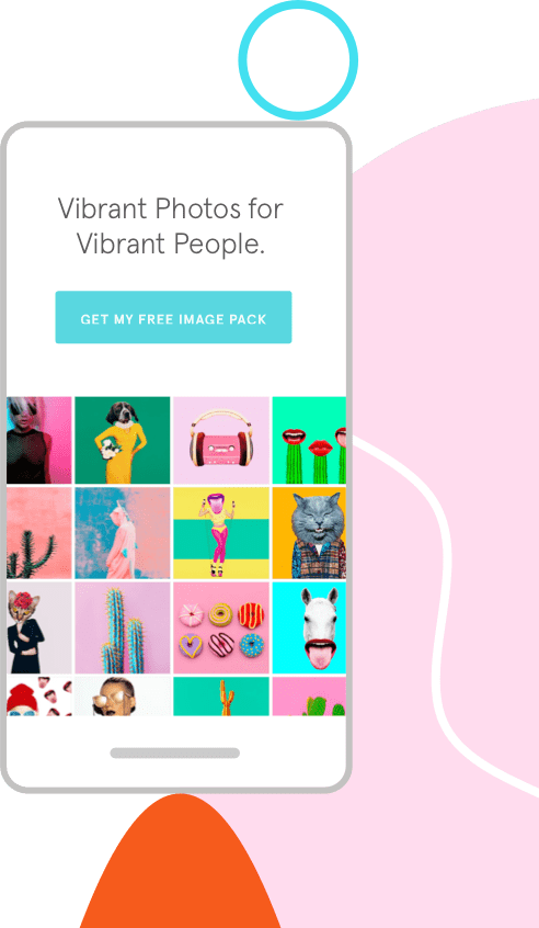
Bottom line: Your landing page design should be clear and simple with contrasting colors, supportive imagery, and consistent branding. By focusing on how to design landing pages, you’ll start to see a major increase in the effectiveness of your landing page conversion.
How to create a landing page
You know why you need sales pages and opt-ins, but now it’s time to get to the nitty-gritty to learn how to create a high-performing landing page.
What is a landing page and how does it work?
Landing pages are equal parts art and science, but even the creative process is—just that—a process, with steps that get you from square one to sky-high success.
In case you forgot, a landing page is a stand-alone webpage that (1) is designed for a specific target audience and (2) aims to compel that audience to take a specific action.
Creating a landing page can be surprisingly simple—when you start with a clear process. Like any project, the more thought you put into it before you begin, the better the result you’ll wind up with.
Here are five easy steps that will make you the ultimate landing page builder and marketer in no time.
1. Set a clear goal
Why do you even need a landing page? What’s the purpose? What are you going to do with it?
Figuring out what you want from a landing page and defining your goal upfront will guide your decision making, from what images to include to what information to collect on your form. This can help you create a landing page that brings you to a better result.
Some potential landing page goals:
- Generate more leads
- Boost sales of a product/service
- Generate event registrations or webinar signups
- Engage with existing customers or reactivate lapsed customers
- Recruit new hires
Every landing page needs a single, specific purpose and should be tied back to a business or marketing outcome. Until you can quickly articulate what a page’s goal is, you shouldn’t go on to the next step.
2. Choose your template
Making a landing page doesn’t necessarily mean starting from scratch. Even though you can customize your landing page template (or build it from scratch if you choose to do so), you’ll find that starting with the right template will streamline your building process and set you up for higher conversions and greater success.
Within Leadpages’ landing page template gallery, you’ll find more than 150 pre-designed, carefully optimized, mobile responsive landing page templates that can be tailored to match your business, industry, audience, and goals.
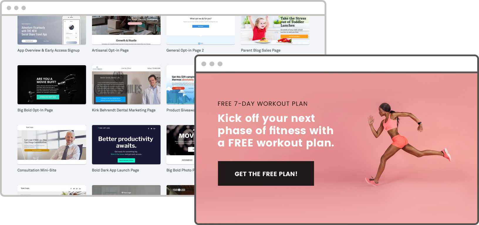
There are three main types of templates: squeeze pages, splash pages, and sales pages. Learn more about the types of landing pages you might want to try out at different points of your funnel.
You can select any template that works with your objective. You’ll have access to everything from a fitness studio recruitment page to bring more personal trainers onboard to an Instagram webinar opt-in page to generate event signup leads. You have so many options at your fingertips, you’re bound to find the one that seamlessly fits your needs.
Pro tip: Responsive landing pages are those that automatically adjust and rearrange content to provide an optimum experience across different device sizes. By ensuring that your landing page displays well wherever (whenever) people visit that URL, you can ensure the best possible results. But don’t worry—all templates within the Leadpages website and landing page builder are expertly engineered to be mobile responsive.
3. Customize your content
Once you have a template, you can customize it to suit your needs and showcase your brand. Easily add your logo, choose the images, tweak the design, and include your own copy. The purpose of customization is to create a consistent brand experience that engages your audience and pushes them towards your call to action.


Of course, the content you choose is one of the biggest factors in determining how your audience will respond and how your page will convert. When we consult on how to create a landing page, we emphasize the importance of customized and branded design, copy, and content.
Need help customizing your landing page? Here are some resources to get you started:
4. Pull it all together.
The content you choose and how you arrange it on the page should push your visitors toward a single point of conversion (aka the offer). This means you want to create a landing page centered around a single call to action (CTA).
Looking to generate leads with your landing page? Offer a lead magnet in exchange for an email address. Want to increase revenue and sell your product or service? Include a checkout right on your landing page or within your Leadbox (pop-up form).
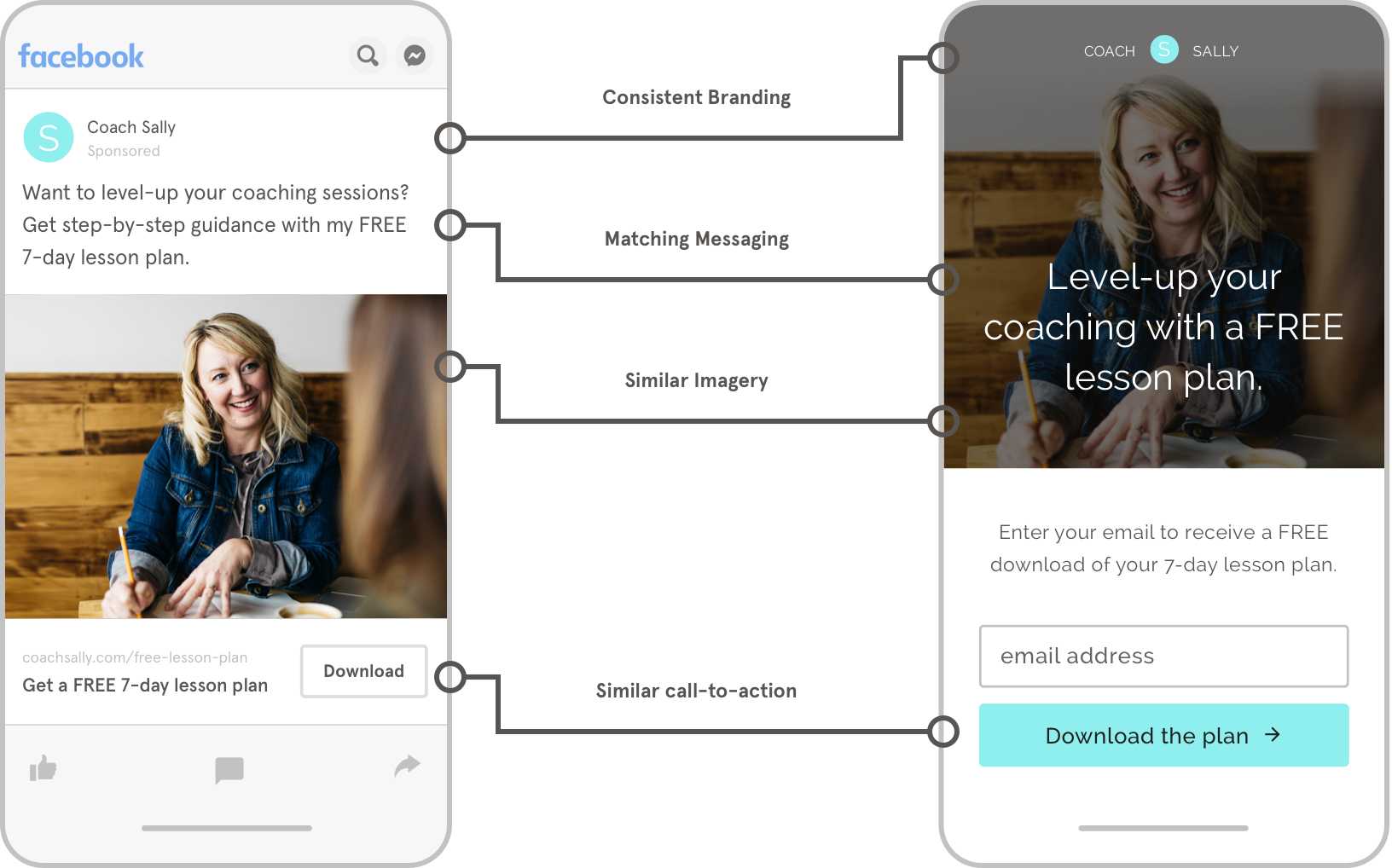
Keep in mind that your landing page and traffic source need to be carefully aligned and consistent in order to reassure visitors that they’re on the right path. This is known as the post-click experience. A cohesive, consistent campaign conveys that your brand is credible and trustworthy. Each touchpoint along that campaign journey is ultimately leading up to the conversion that takes place on your landing page.
5. Let’s get going.
Now it’s time to publish! After you publish, it’s up to you to share that landing page link through your marketing channels, such as social media or pay-per-click (PPC) ads.
You might want to consider building two versions of your landing page to run A/B testing. This allows you to try out different design and copy to see which resonates best with your audience and promotes the highest number of conversions. Learn how to properly test your landing pages here.
Can you create a landing page without a website?
How much does it cost to build a landing page?
Bottom line: It can be simple to create a landing page by breaking it down: choose an objective, customize a template, ignite the web traffic, and test multiple landing pages.
Top 10 Landing Page Best Practices
Here are 10 landing page best practices that you can apply your own landing pages: from architecting your page like an argument, to CTA buttons, and more!
Creating a landing page is easy. Creating landing pages that convert takes a bit more effort. Since 2012, Leadpages has been a leader in the landing page universe, so we’ve seen what makes the most successful landing pages convert the best, and what elements sabotage results.
Lucky for you, we’ve compiled some of our best practices for landing pages to ensure you’re turning the most web visitors into qualified leads. By utilizing the most effective landing page design, content, and conversion tools, you can improve your conversion rates with landing pages, too.
Since different landing pages have different objectives, each page is unique. But the most successful landing pages are set up with a similar strategy. After publishing over a million pages for thousands of businesses, we’ve noticed some key patterns that you can put to use on your own pages (and we’re sharing all of our best secrets here with you).
Here are 10 landing page best practices that you can apply to your own landing pages:
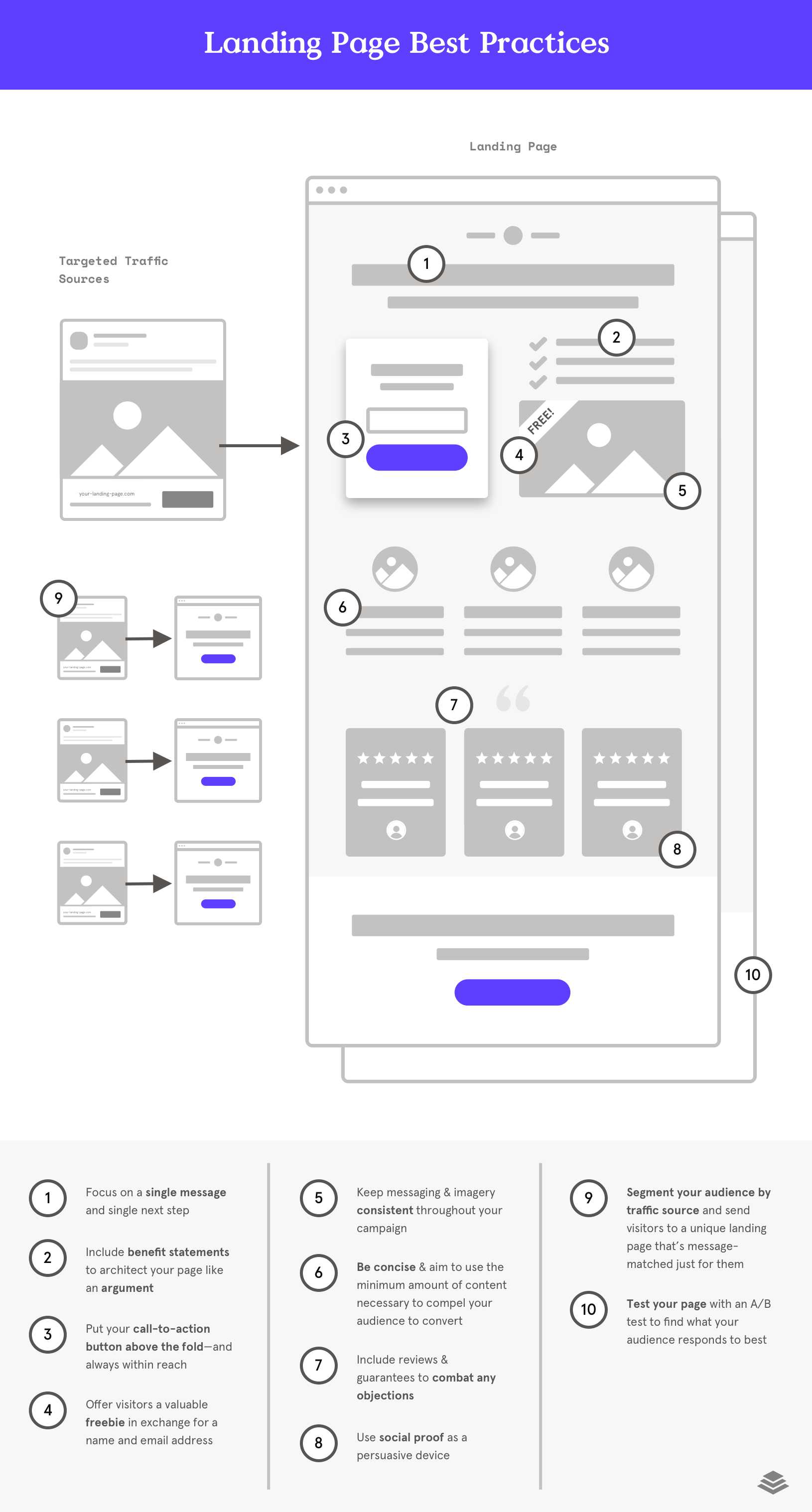
- One page = one purpose
When landing pages try to do more than one thing at once, they tend to under-perform. Stay focused on a single message and single next step (point of conversion). If your landing page copywriting or page length is dragging on, you may be trying to accomplish too much. - Craft your landing page like an argument
Consider your visitor’s perspective and where they are within your customer journey: what do they most need to know and feel in order to take that next step? What content format is most suitable for delivering that information? How will your landing page design craft an argument and provide additional persuasion as a visitor scrolls down? - Put your call-to-action (CTA) button above the fold—and always within reach
Your CTA button should be immediately within view when a visitor lands on the page. It should never be more than two scrolls away. One of the most important landing page design best practices is “CTA prevalence,” meaning your call to action is the most frequently used aspect on the page. - Give before you get
The most successful lead generation landing pages offer visitors something valuable in exchange for a name and email address. These freebie content offers (lead magnets) typically take the form of a downloadable file, webinar registration, or online consultation. When you need landing page inspiration, consider how you’ll build your page surrounding your lead magnet. - Keep it consistent
Your landing page is often part of a larger campaign. Keep your page’s message, mood & tone (imagery) consistent with the ad that visitors first clicked on and carry over that same look onto the thank you page. - Be concise
Wondering what to include on a landing page? Aim to use the minimum amount of words, imagery, and multimedia necessary to compel your audience to convert. Streamline the experience of your page and edit out all possible distractions and disruptions. Remember this landing page tip: when it comes to content, simple is often more successful. - Reduce or remove risk to overcome objections
While you construct your page, consider what barriers could possibly block your visitors from converting. Then, include content that combats the primary objections.- Guarantees such as satisfaction or money-back guarantees can be used when price is a barrier.
- Social proof is an excellent way to gain the confidence of first-time subscribers from cold traffic.
- Simplified opt-in forms that only request first name and email increase conversion rates and reduce friction.
- Include social proof
People will naturally conform to other peoples’ behavior and naturally gravitate toward what their peers say and do. Social proof is a powerful persuasive device and can take the form of testimonials and reviews. - Segment your audience by traffic source
Landing pages are powerful tools because of their ability to deliver a unique message to a narrowly defined audience. Leverage this strength by sending your pay-per-click (PPC), social media, email, and organic traffic to separate, targeted landing pages that are message-matched just for them. Even consider creating different landing pages for desktop vs. mobile visitors. - Set up an A/B test or split test to find what truly works
The best marketers are also mad scientists – constantly testing out new content, design, messages, etc., to find what their audience responds to best. After publishing your landing page, consider what you’d most like to learn from a landing page split test and what your testing strategy will be.
Get real-time landing page guidance with Leadmeter
Leadpages is the only platform that automatically analyzes your landing page and provides recommendations so that you can better predict how your page will perform before you publish. Powered by proprietary AI technology, the Leadmeter combines the power of big data with landing page best practices.
Bottom line: Use these top 10 best practices for landing pages to create clean, succinct, value-driven pages. You’ll attract and engage more customers if you make it easy for them to understand what they’re getting from you, and you pay attention to what works for different segments of your audience.
What should I test on my landing page?
Creating a simple landing page test plan helps you boost conversion rates by crafting your content around what compells your audience to take action.
The best way to make the most of every possible page visitor is to run (rigorous) A/B testing landing pages so that you can hone in on what makes one page outperform another.
From images and copy to landing page design – you can run an infinite number of landing page tests to optimize your conversion rate, but we want you to focus first on the high-impact areas that will give you the highest possible return right away.
Here are the top 5 landing page tests to see the greatest success fast.
1. Variations of your headline
Your landing page copywriting is a huge factor in persuading your audience to take action and it all begins with the headline. Test out different lengths, sentiments, and tones.
For example: which headline is more compelling?
- Save $200 on your next photography session!
- Get 40% off when you book today!
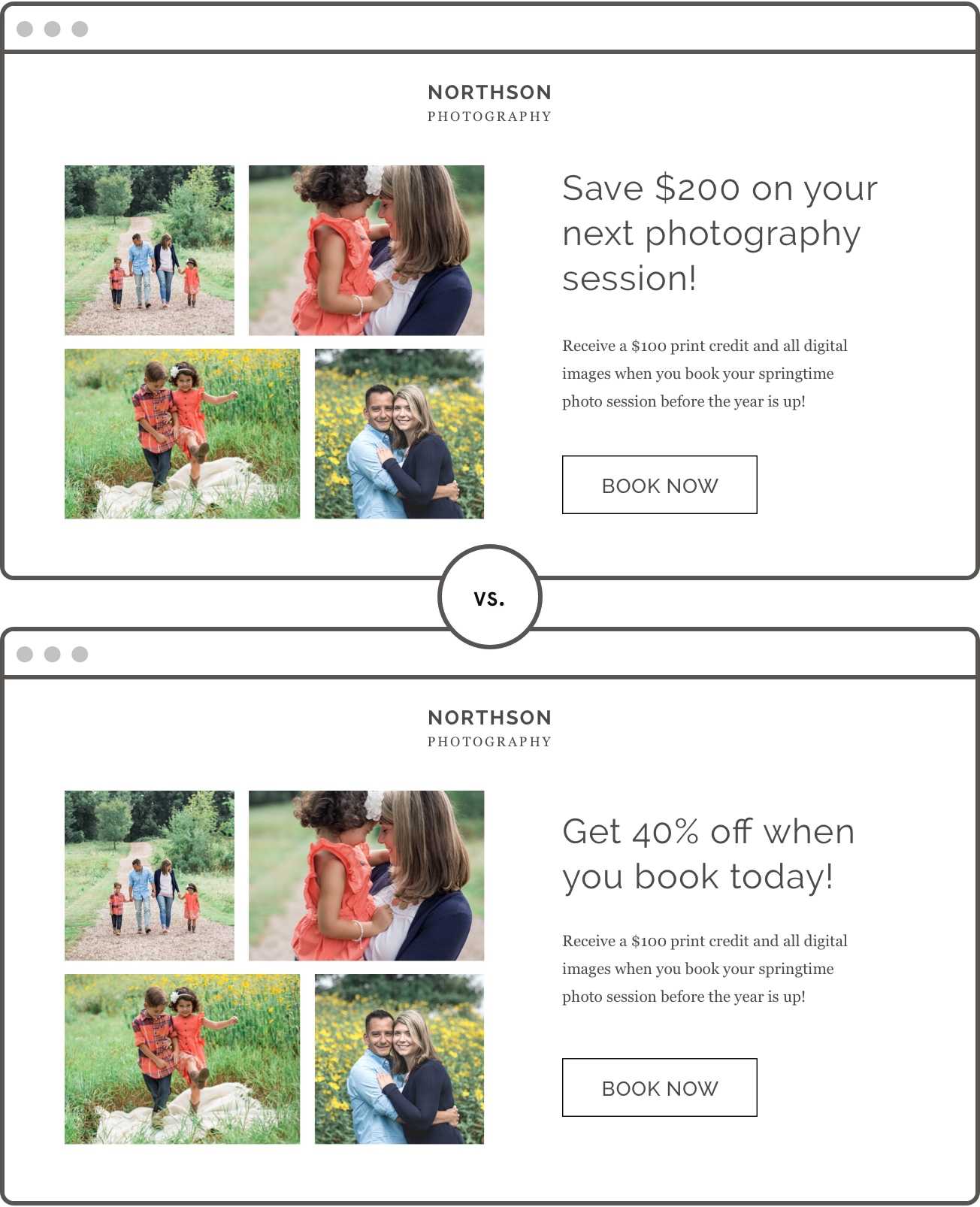
Both headlines present the same offer (a sales discount) and use unique language. But which is better? You just don’t know until you test it!
2. Your call-to-action copy
Your call to action (CTA) button is where all of the conversion takes place and should be (1) clear and (2) compelling, with a touch of creativity if you can squeeze it in.
Don’t settle for run-of-the-mill language like ‘submit’ or ‘download.’ The words you choose for your call to action should describe what the visitor is doing when they take the next step but should also be enticing.

3. Length of the page
This is the Goldilocks question: is your landing page too short? too long? or just right? Because the length of your landing page actually plays a huge role in your conversion.
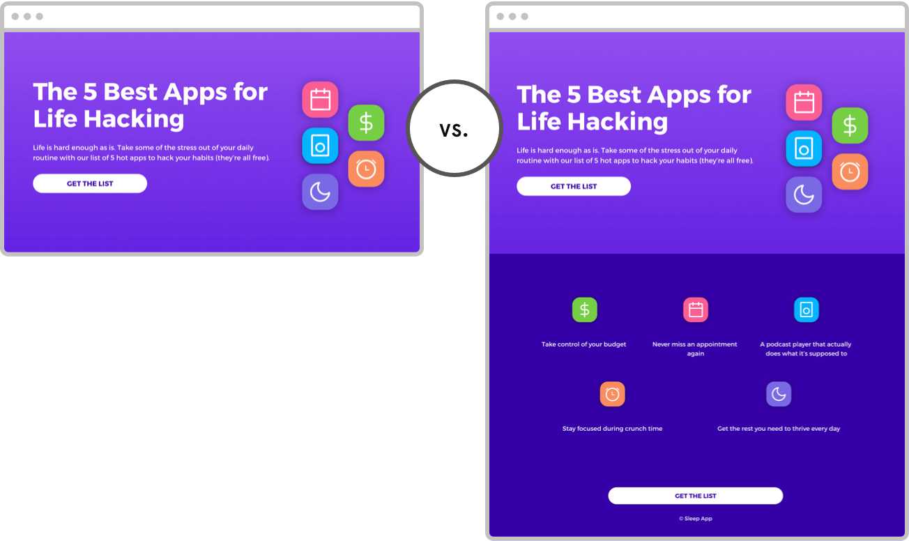
You can make some educated assumptions about how long your page needs to be (the more familiar your audience is and the fewer the barriers to conversion, the shorter the page). However, you simply don’t know until you test.
Test out different page lengths or hide whole sections of content to see how your content impacts your conversion rate.
4. Your page design & aesthetics
Test out the design of your page by testing different hero images, CTA button colors, font stylings, or layout.
Isolate one single landing page design element that you’re interested in learning about and see what appeals most to your audience.
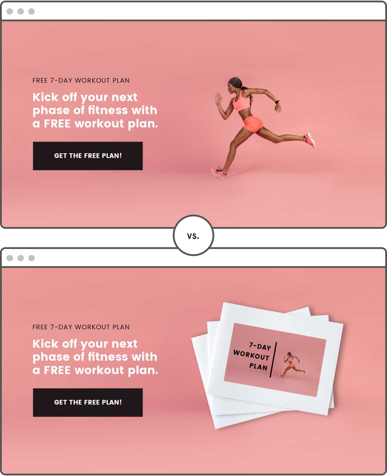
Consider testing even the seemingly-smallest elements of design. For example, should you include a navigation bar at the top of the page or not? Should you use client testimonials with or without a picture? Does red look better than orange?
Landing page testing tools, like Leadpages integrated tester, make design comparison a breeze.
5. Your offer (or price point)
You can even test the offer itself. Perhaps one topic will resonate more than another, or checklists will outperform ebooks (as we discovered at Leadpages!). You might even try testing out different price points to see how much your audience is willing to spend.
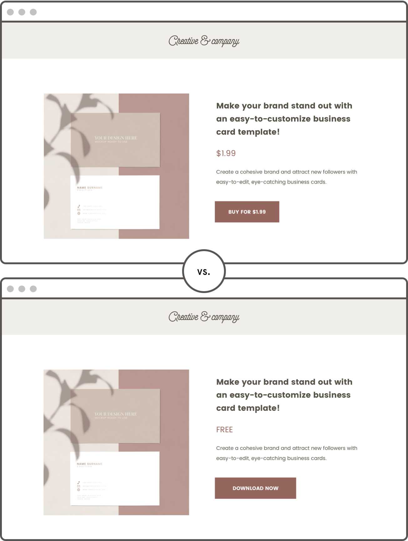
Will they pay $4 but not $5 for an eBook? Surprisingly, some people won’t convert for a free downloadable, but they’d pay $1.99 for the same downloadable because they perceive more value in it. Free is not always the answer (although it usually is).
The nature of your offer is the foundation of your landing page. Make sure it’s something your audience truly wants.
How should a landing test page look?
You want your landing page test to look like any other landing page. You don’t want your customers to even realize they’re looking at a test page. Your landing page should be completely formed with well-written copy and design, so you can fully see which variables are and are not working. Follow our landing page best practices to start creating beautiful test landing pages.
Bottom line: Make no assumptions and try not to let your personal preference influence your digital marketing. Experiment and spend time on landing page tests to ensure you optimize for the highest possible conversion rate.
How do I send traffic to a landing page?
Need web traffic without all the expense? Learn proven tactics to take your web page from published to popular to profitable on the web.
After you’ve published a page, it’s time to promote it and get it into the hands of your target audience. But where do your visitors come from before they ‘land’ on your landing page and how can you drive more traffic to your most important pages?
The most common landing page traffic sources (or digital marketing channels) include pay-per-click (PPC) ads, organic search, social media, and email marketing. Some traffic sources require that you spend some of your marketing budget, while others can are free for the marketer willing to make the best effort.
In any case, your goal, as a marketer, is to meaningfully engage with visitors on a third-party channel (such as a social media site) and direct that traffic to your dedicated landing page where visitors can learn more, buy now, and convert. How you use landing pages in your marketing depends on what you’re offering, to whom, and where your audience is coming from.
Most of the time, that can be done with a few simple strategies for driving traffic. Let’s look at how to promote your landing page by attracting and engaging the right visitors from the source.
Start at the (traffic) source
Even if you have the best landing page builder and your landing page is converting 80% of the traffic you send it, it could still be unsuccessful. Why? Unless that traffic represents your target audience, your landing page is winning a battle but losing the war.
It doesn’t matter how much money you spend (or don’t spend) on digital advertising, all web traffic is not created equal. It comes down to a strong focus on what criteria you’re using to target people, where they’re coming from, and whether your landing page delivers on its initial promise.
Your traffic sources are the foundation of your marketing funnel and will ultimately determine both the quality and quantity of your inbound leads (and customers).
How web traffic works within your marketing funnel
Wondering how much traffic you need or how many leads you should generate each month? Your landing page traffic acts as your denominator and determines how many people will ultimately trickle through the rest of your sales and marketing funnel.
For example, let’s say your Facebook ad reaches 100,000 unique users, and 1% of those users click through to see your landing page. That means that 10,000 people reach your page, which has a 50% conversion rate—leaving you with 1,000 new leads.
By considering how many leads you convert into paying customers and working your way backwards up the funnel, you can ultimately calculate how much web traffic you need to drive to your landing page every month in order to reach your goals.
However—getting to those goals require you to get into the granular detail of how and whom you’re targeting. This all comes back to the initial traffic source. Where and how you find traffic will determine how you promote your landing page and the quality of the leads you’re attracting.
For example, let’s say that you sell coaching services for retirees. Your target audience is between the ages of 50 and 70. You decide to run an Instagram paid advertisement. Although 5% of Instagram users are over age 55, the majority are between ages 18 and 35.
This means you’re not only wasting your money targeting your ads at the wrong people but also anyone who clicks through is not likely to become a customer. You’d likely do better with a Facebook or Google paid ad.
You want your traffic source to attract the right kind of traffic, so you’re more likely to engage and convert those visitors into leads.
Where can I find traffic?
Alright, let’s find great landing page traffic with the right sources!
1. Pay-Per-Click (PPC) Ads
Pay-per-click ads come in all kinds of shapes and sizes: from paid ads on social media platforms to display ads and search engine marketing (SEM).
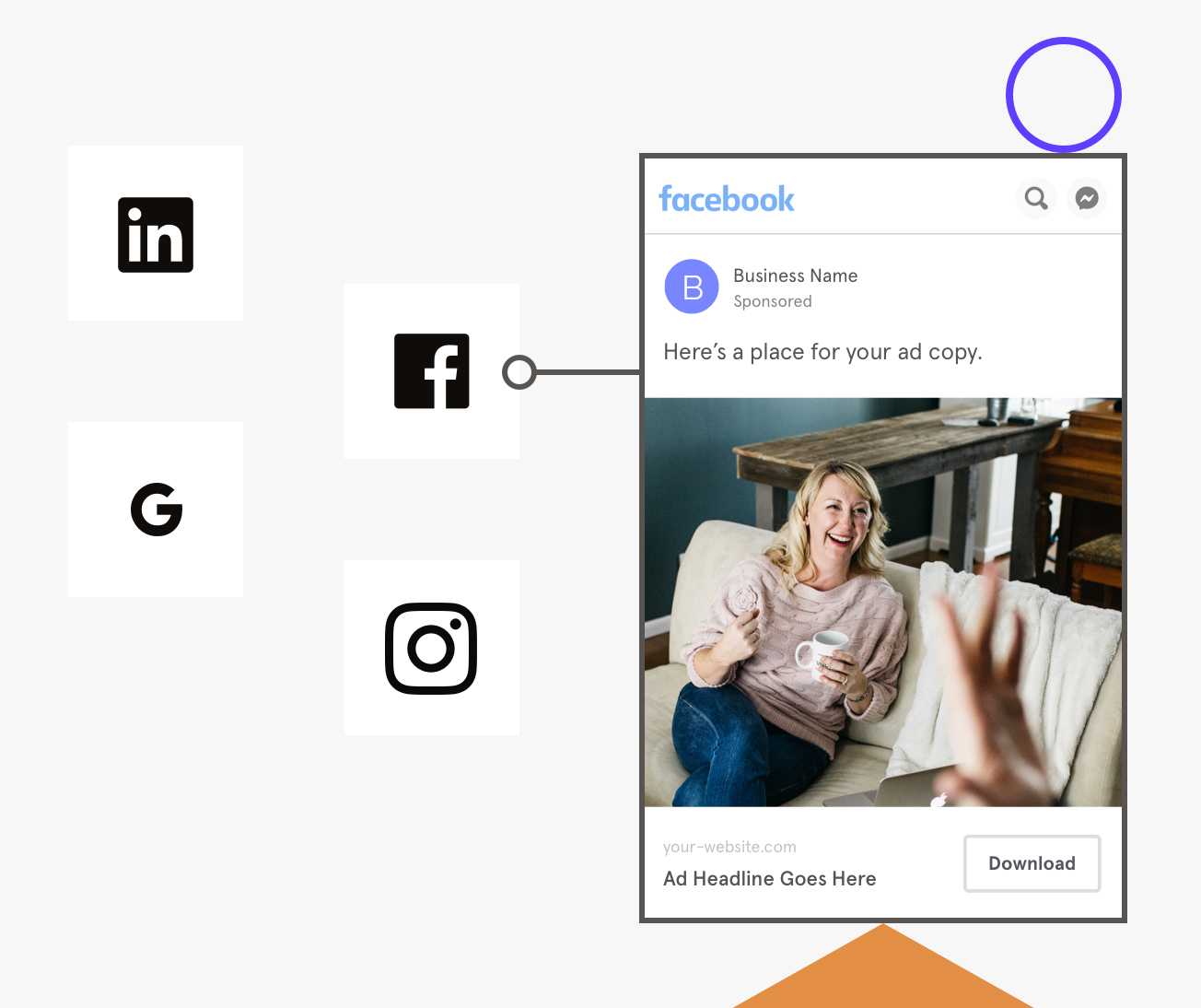
Depending on the platform you use—whether it’s Google Ads or Facebook ads or a third-party—you have a limited ability to (1) capture people’s attention (2) deliver a message and (3) compel people to click to the next step.
That’s where landing pages enable you to own your post-click experience and deliver content that’s tailor-made for that unique audience and traffic source. Unlike a standard webpage, Leadpages landing page software affords you the flexibility and agility you need to integrate with your paid advertisements and make a high return on ad spend.
Pro Tip: Consistently run A/B and split tests on your PPC landing pages to scientifically squeeze the most value out of every dollar you spend on digital advertising.
2. Social Media
There are nearly 2.7 billion social media users worldwide, and an estimated 77% of the U.S. population has at least one social media profile. Therefore, social networking sites are one of the most powerful ways to spread your message to a large, captive audience.
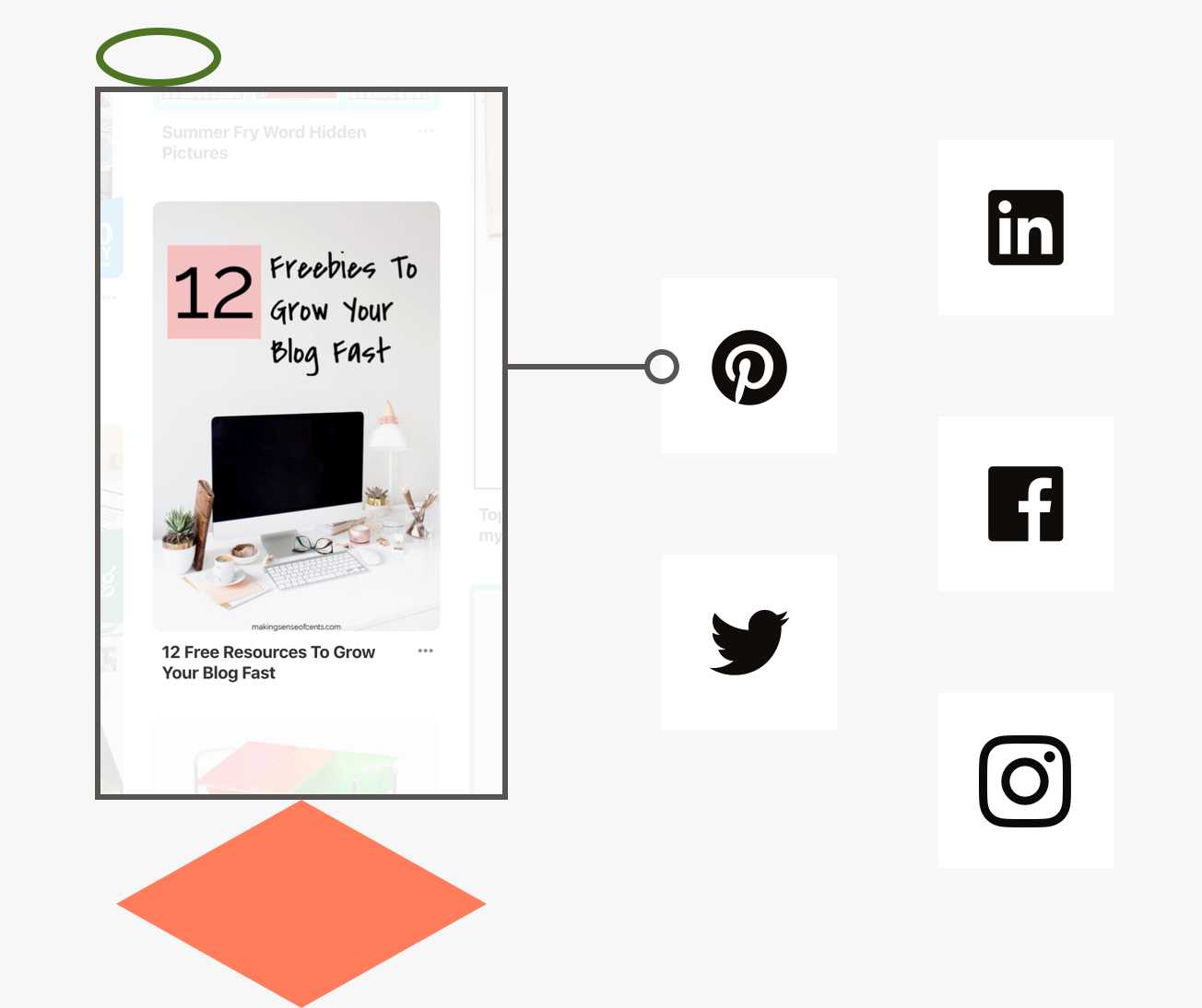
Social media works well because you can use attractive visuals and enhanced copy to create a community of followers that will naturally engage with and advocate on behalf of your brand. It’s also is a great way to pique visitors’ interest and encourage them to click through to your landing page to learn more or complete a purchase.
Pro Tip: Don’t just think about how to promote your landing page on Facebook, because you hear other businesses doing it. Rather than chasing the next top-trending platform, focus on the social media sites where you have the largest and most engaged following.
3. Content Marketing
Content marketing involves strategically delivering content throughout your customer journey in order to convert traffic to leads, leads to customers, and customers to raving fans. The most successful content marketing involves a multi- or omnichannel approach and remains highly targeted toward a narrowly defined audience.
Depending on your audience’s needs at various stages, you might educate, entertain, or inspire through your content with the understanding that if people find value in your content, they’re more likely to consider your brand when they’re ready to make a purchase.
Here are some traffic-driving content marketing tactics to consider for your business:
- Embed content upgrades ( lead magnets ) in your blog posts
- Guest blog for third-party websites and include a link to your primary landing page.
- Publish press releases online and with local news organizations and include a link to your landing pages (if permitted).
- Appear as a guest on a podcast and direct people to your landing page on-air and in the show notes.
- Submit inquiries to HARO ( Help A Reporter Out ). Usually, you will provide a short interview answer and a backlink to your site or landing page that comes from a reputable source.
Pro Tip: Wherever and whenever you publish, always ask if you can include a link. The more links to your landing page, the more likely you’ll attract a click.
4. Email Marketing
Your email list is one of the business’s biggest assets, but only if you’re constantly nurturing those leads and providing them with new opportunities to convert.
That requires that you produce content and engagement opportunities for your existing leads and customers as well as prospective audiences.
These warmer, more engaged audiences are more likely to be ready to make a purchase (or higher-ticket purchase) if only you’d provide an opportunity. Use your landing pages to invite these individuals to join a webinar, make a purchase, or take advantage of a promotion.
Pro tip: Email marketing is the best traffic source for a sales page since you are pulling on pre-qualified leads to make the sale.
Bottom line: Where and how you get your landing page traffic is critical to the success of your marketing funnel. Focus on traffic sources that provide a high volume of visitors that are relevant to your lead magnet and business.
Lead magnets 101
Here’s (almost) everything you need to know about lead magnets and content upgrades to build your email list and turn strangers into subscribers.
Growing businesses hungry for more customers all face the same challenge: transforming web traffic into leads. Sure, it’s great to see that people are landing on your site, but unless you can actively market to those individuals – well, you’re pretty much stuck on the sidelines. Lead magnets are the #1 way to generate leads and grow your business online.
They come in all shapes and sizes and are utilized by world-renowned brands as well as small businesses just starting out with digital marketing.
Having web traffic on your site is great – but it’s not the end goal. In order to build your business (and actively market your product/ services) you need to transform traffic into leads by collecting email address.
But…when was the last time you gave out your contact information for free? …how about, never?
Your audience isn’t going to give it away for free either. You’ll need to offer an incentive – and that’s what a lead magnet is all about.
Getting someone’s contact information is what converts anonymous web traffic into prospects or leads, because (1) you can be reasonably sure they’re interested in your offer and (2) you have an (active) way of staying in touch.
Typically, lead magnets take the form of downloadable content (ebooks, PDF guides, worksheets, etc.), instructional video, free consultations, webinars, etc. But we’ll get into this later.
How do lead magnets work?
The mechanics of how a lead magnet works is really quite simple: you have to give something away to get something in return. In this case, high-quality free content in exchange for an email address.
A lead magnet most often works like this:
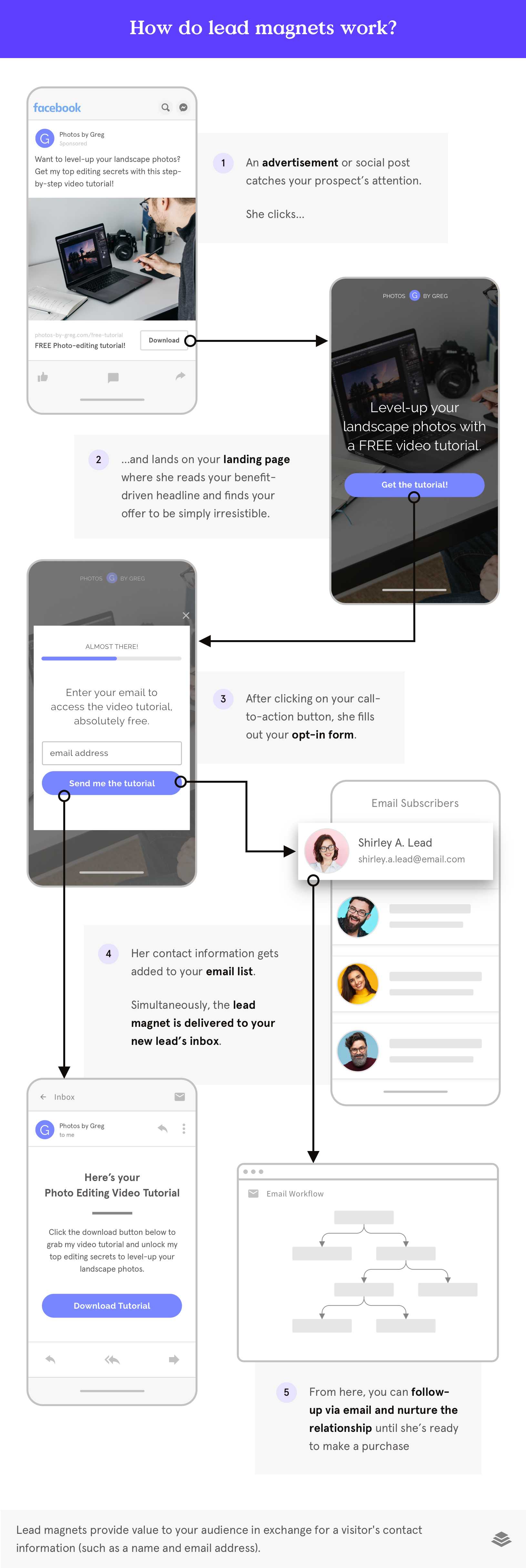
Your lead magnet could be offered in a banner ad, pop-up form, or landing page – depending on where you want to host your offer and how much space you need to explain its value.
Most small businesses use landing pages to introduce their lead magnet. In that case, people who visit your landing page enter their email address in order to access the lead magnet. When they submit their email address, they automatically receive an email containing the lead magnet. You now can contact them with (appropriate, non-overwhelming) future offers and information.
Why use lead magnets?
Your email list/ database of leads is your #1 resource for marketing your product or service. You need high-quality (relevant) leads and subscribers that you can reach out to with (non-overwhelming) content whenever you want to. Lead magnets are how you grow your email list and fill your marketing/ sales funnel with people who want to receive what you have to offer.
What are common types of lead magnets?
From free video courses to a downloadable checklist or eBook, there are a near-infinite number of lead magnets that you could create for your lead generation campaign.
Here are a few common lead magnet examples to keep in mind:
- Ebooks
- Checklists/ cheat sheets/ resource guides/ tip sheets/ FAQ sheets
- Worksheets/ workbooks
- Email courses
- Swipe files/ templates
- Webinars/ webinar replays
- Calendars/ action plans
- Industry reports
- White papers/ case studies
- Live demos/ tutorials
- On-demand video trainings/ courses
- Contests
- Quizzes
- Product samples/ free trials
- Consultations/ 1:1 calls
Which lead magnet is right for your audience?
Sure, the sky’s the limit when it comes to what lead magnets you can create. But which type of lead magnet is right for your audience and for your specific lead generation campaign? How will you make sure your landing page’s traffic sources are effectively targeted in order to attract visitors that will engage with your lead magnet?
The most successful lead magnets are those that are thoughtfully tailored to attract a very specific audience and meet a very specific need at a particular point in that audience’s experience with your business.
There are a handful of variables you’ll want to consider:
Before you decide what format your lead magnet should take, first consider:
- Who is your audience? How engaged are they with your business? How hard are they willing to work to get value from your offer?
- What (specific) problem are you trying to solve for your audience? Whatsolution do you propose?
- What’s the ideal content format to deliver that solution?
- What do you have the ability to create? (text, video, audio, graphics, etc.)
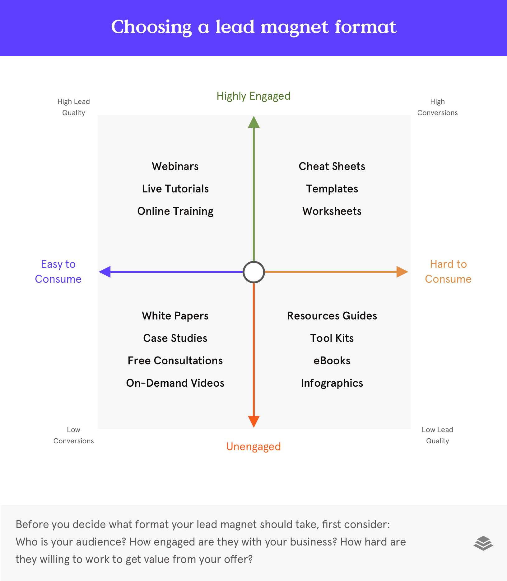
Which lead magnets are right for your marketing channels?
When creating your lead magnets, it’s important to tailor them to each marketing channel—but even more important that they suit the type of audience you’re reaching out to. For example, the colder or less familiar an audience, the easier the lead magnet should be to consume: checklist vs. a long ebook.
How do you make a lead magnet on Facebook?
We often hear people asking about which lead magnet is right for Facebook – we recommend matching the audience type to its’ needs rather than the channels. This way you’re able to focus on what your audience truly needs and not get lost chasing what your competition is creating
How do you make a lead magnet?
If you’re not a professional writer or designer, making your own lead magnet can feel daunting but it doesn’t have to be. Here’s how to get started:
- Hone in on a single problem that your audience cares about
- Create content that addresses that single problem
- Commit to a format that suits your topic and type of audience
- Include an opportunity to upsell
- Create ads and landing pages that help you bring your lead magnet to the world
10 Tips to Get Started with Your First Lead Magnet + Lead Magnet Examples
New to lead magnets (maybe still even confused as to what are lead magnets) and not sure how to get your lead generation off the ground? Not to worry. You’ve likely seen opt-in offers all over the internet and now that you’re tuned into this marketing technique, you’ll spot even more!
Keep your eyes open to learn from other businesses and to inspire what’s possible for your business. But in the meantime, here’s our lead magnet checklist to get you started.
#1 – Hone in on a single problem
Don’t try to ‘boil the ocean’ or solve every problem with a single, downloadable worksheet – you’ll drive yourself nuts! Keep it specific.

In this lead magnet example by Bold and Zesty, they keep their offer highly specific: 3 must-have drip email campaigns in 1 PDF.
#2 – Connect the dots
Ideally, your lead magnet ties back to your primary service/ offer. Think of this as the first-step in your product pyramid. You can (subtly) mention your products or services, but definitely, don’t try to use your lead magnet as an advertisement.
At Leadpages, we build this strategy into everything we do. Here’s one example:
We used to offer lots of free landing page templates to download and follow-up with invitations to put those templates to good use inside a free 14-day trial of Leadpages.
#3 – Say it Straight
In most cases, you won’t have a lot of space to wax poetic about what your lead magnet is and why people should download it. You’ll need to get straight to the point and answer 3 key questions in as few words as possible:
- Why should your audience care?
- What are you offering?
- What action should they take next?
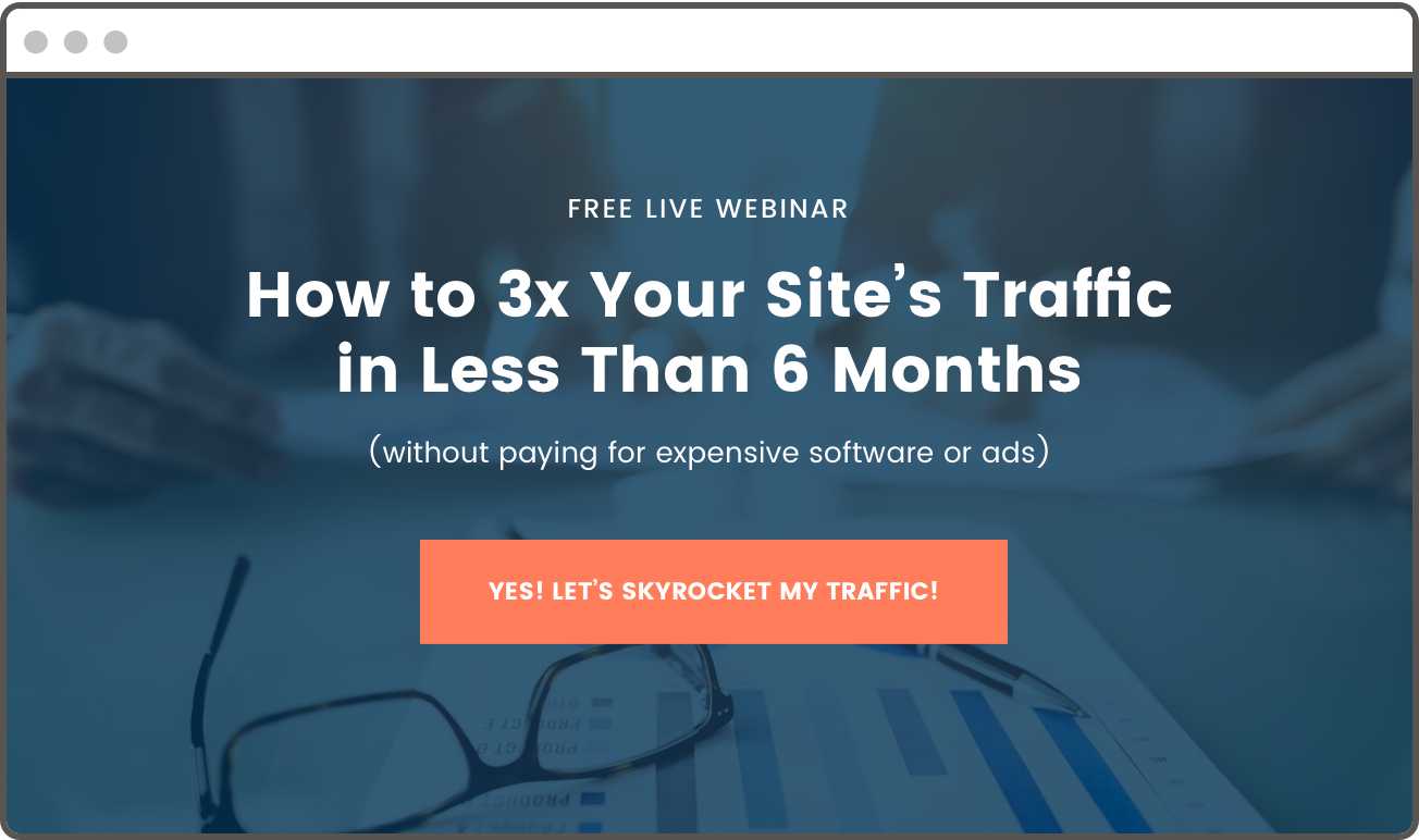
In this lead magnet example, all 3 key questions are addressed: why your audience should care (How to 3x site traffic in 6 months), what it is (free live webinar), and what action you’re asking them to take.
#4 – Don’t get greedy: ask for the minimum
The more information you ask for in exchange for your lead magnet, the less likely your target audience is to take action. Keep your form fields down to a minimum. If possible, stick with just first name and email address.
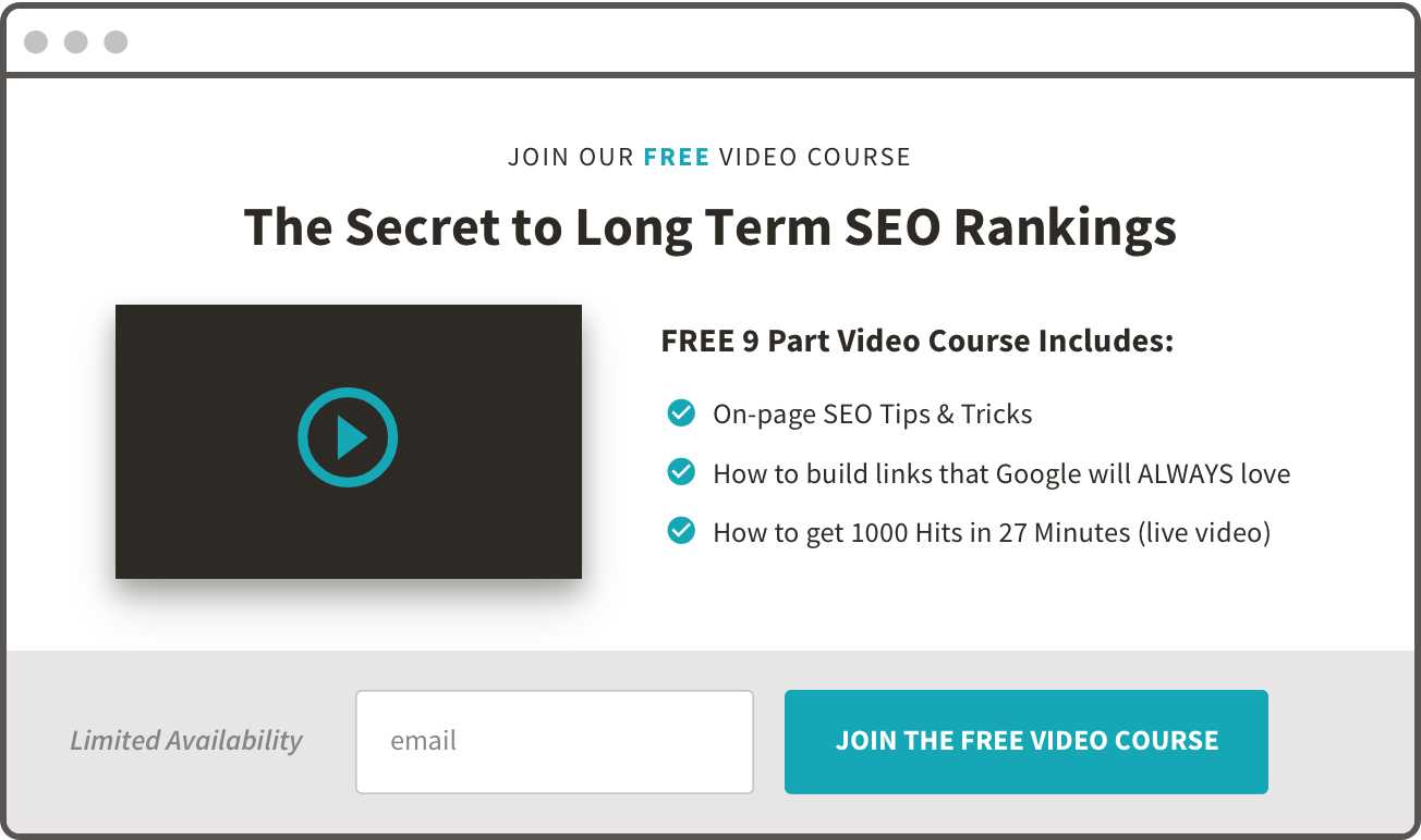
This lead magnet opt-in form from AuthorityHacker.com is a great example of keeping required fields down to a bare minimum.
#5 – Make it bite-sized
If you’re in the market to generate new leads from total strangers, you’ll need to make it super easy to say ‘yes’ to your offer. Cold traffic (those unfamiliar with your business) won’t be willing to work all that hard to get to know you. That means you should keep your offer short, sweet, and simple.
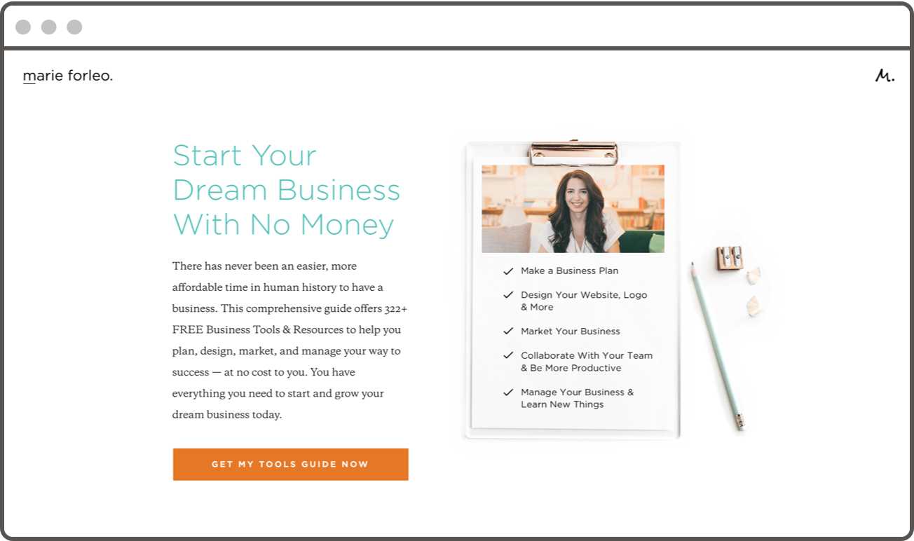
In this lead magnet example by Dexma, a simple 1-page checklist is all it takes to deliver value.
#6 – Tie it with a bow
Product packaging is everything and lead magnet design matters. Make an attractive mock-up of your product or create an eye-catching header image that will carry through your ads, landing pages, and email delivery.
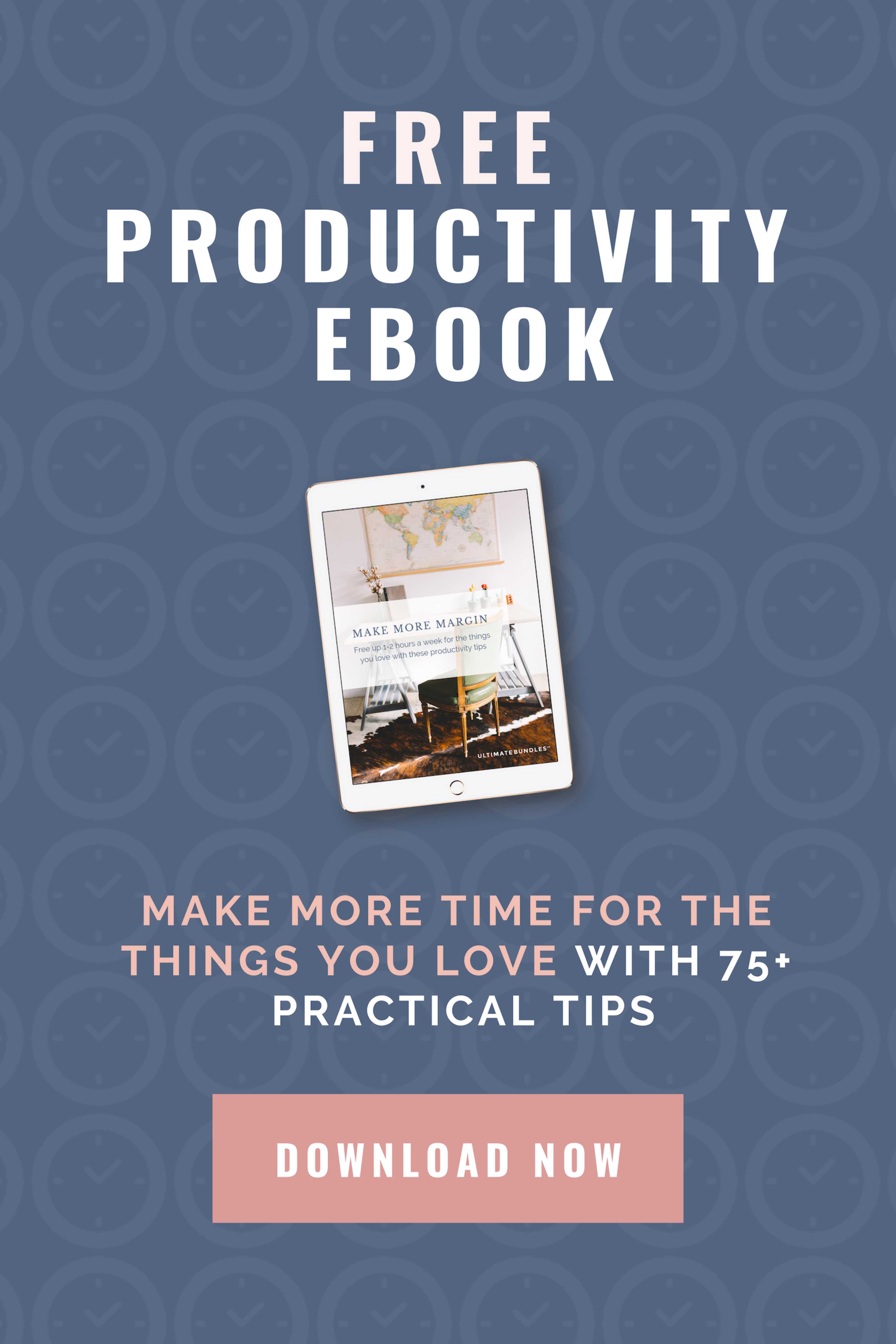
This lead magnet example from Diabetes Strong showcases exactly what’s up for grabs in a very visually appealing way.
#7 – Remember: A Newsletter is not magnetic. (And ‘updates’ aren’t sexy)
Most businesses think their ‘regular newsletter’ qualifies as a lead magnet – but oooh no, that’s not so. Unless you’ve done the legwork to sell your email newsletter as a valuable information product in its own right, when you add opt-in points like these to your site, your visitors are likely to look at them and see: free sales pitches. As if people would generally pay for the privilege of receiving marketing emails. Instead, offer a bonus that gets people excited to subscribe, then immediately delivers info they’ll devour.
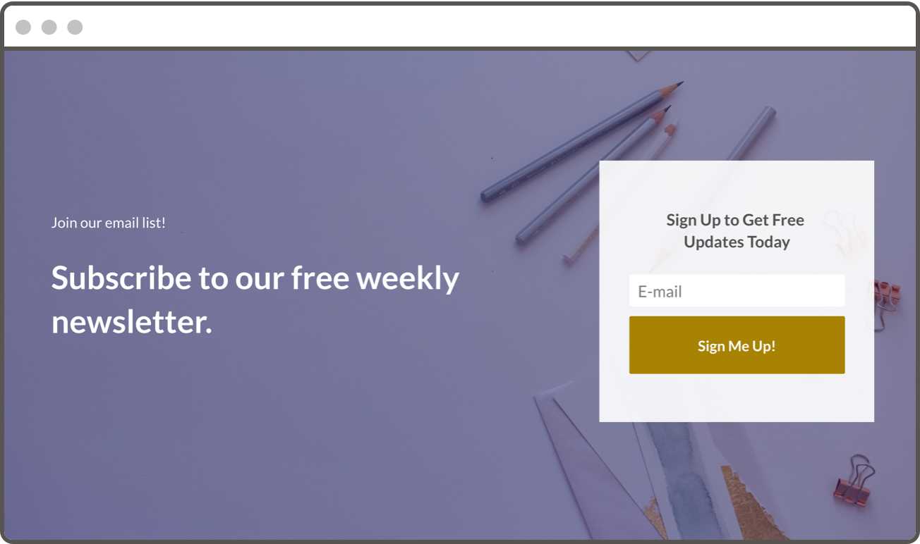
A better way to promote your free newsletter would be to focus in on values and benefits rather than offering free email updates. Source: themodernentrepreneur.com
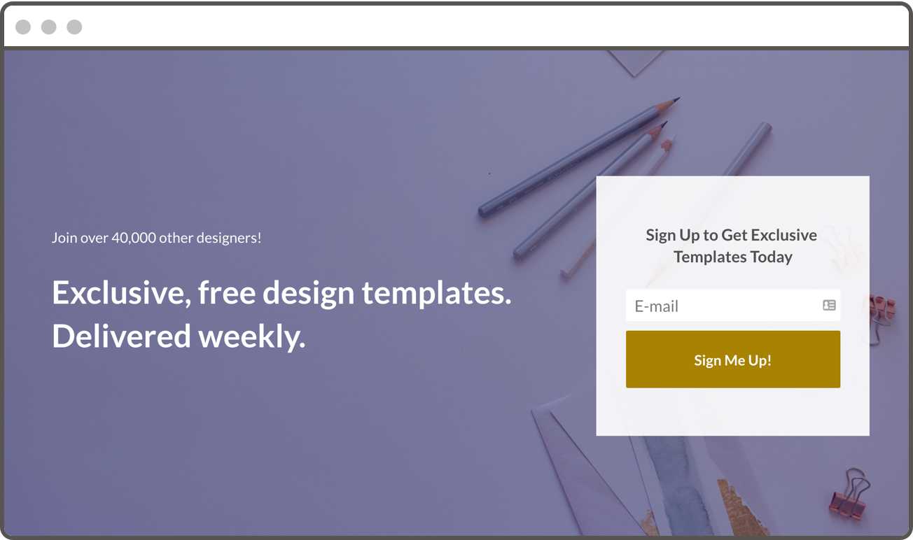
This opt-in offer from Content Marketing Institute is brilliant because it focuses on the value, gives a free download, and adds a pinch of social proof: ‘join 40,000 of your peers!’
#8 – Use thought Leadership to capture leads
A lead magnet strategy can often help establish you as an authority in your industry (or even a just a place to turn for cool stuff). Be benevolent and generous with your expertise, don’t hold back! As soon as your audience trusts your credibility, they’ll be ready to pay for a greater value and increased access.
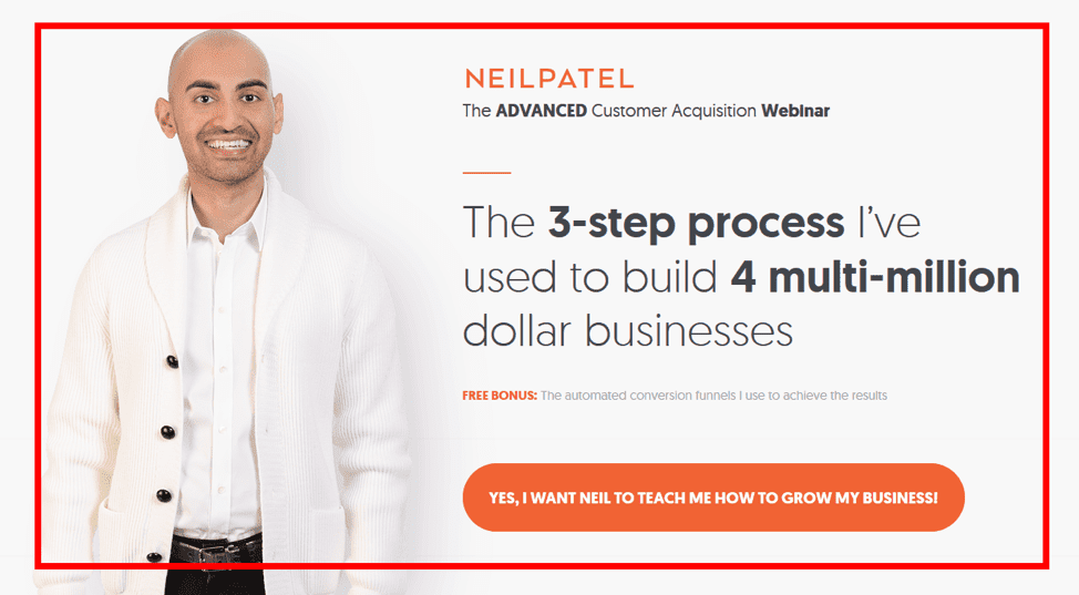
This lead magnet example from Neilpatel.com puts his expertise right there in the headline. Thanks to powerful copywriting, you simply can’t help but trust him and want him as a mentor.
#9 – Deliver on your promise
Double, triple, and quadruple check that your lead generation tool is integrated with your email service provider (ESP) so that you can instantly deliver your free content. Don’t leave a single lead hanging!
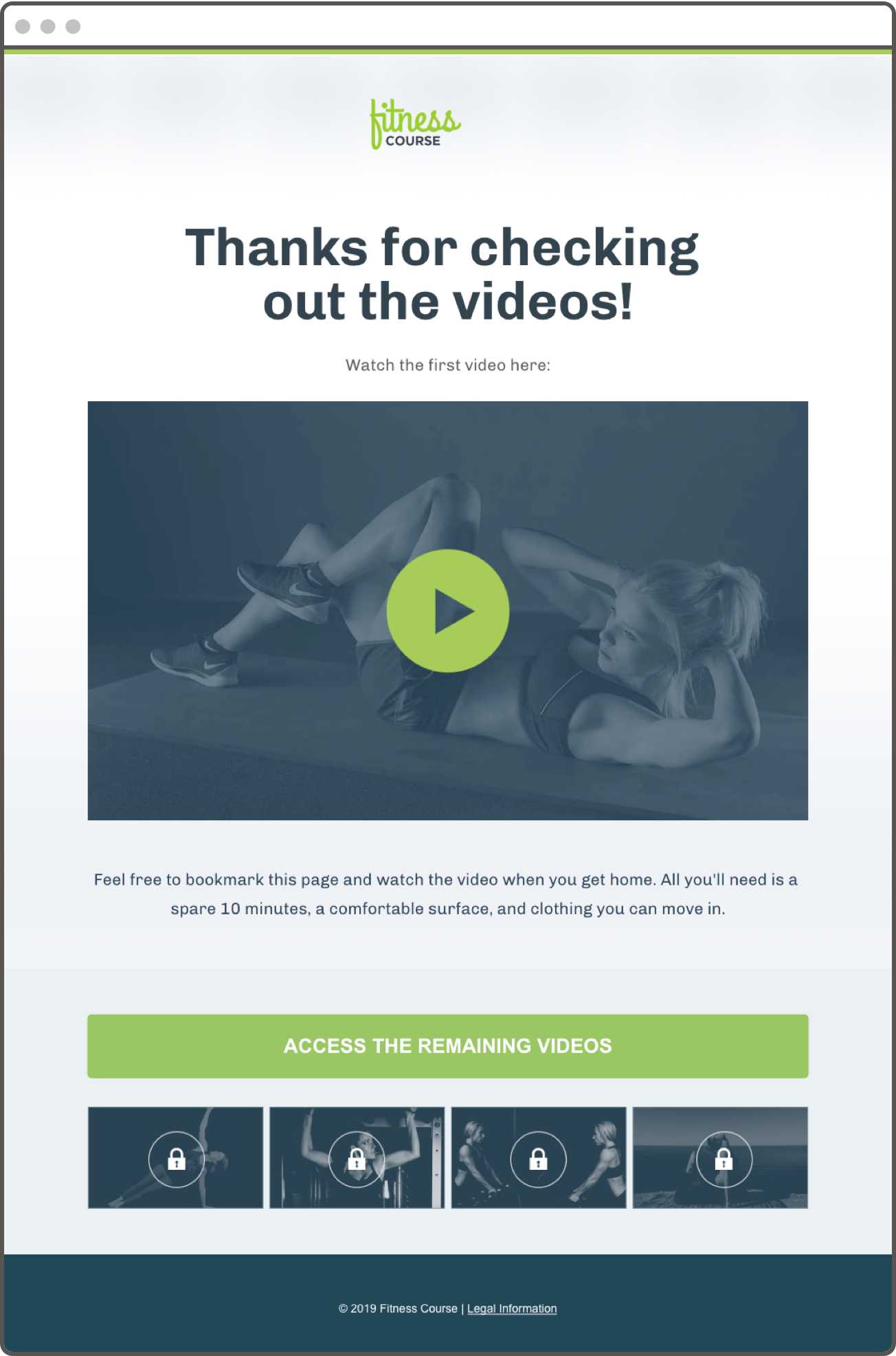
In this lead magnet example, the free guide is delivered right inside the thank-you page and an up-sell invitation is made.
#10 – Back it up with some love: don’t neglect your nurture sequence
Think of your newly captured lead as a new acquaintance. Don’t kick off this fresh friendship by neglecting to follow-up for months. Take immediate action by (1) delivering what you promised and (2) offering next steps. You might suggest that they check out a blog post related to the topic, send over another free offer that takes the topic one-step further or invites them to share their feedback with you.
What’s the Best (and Easiest) Way to Create a Lead Magnet?
There’s no single easy lead magnet format that works best for everyone, but many entrepreneurs find success offering a lead magnet PDF download of highly useful content, such as an e-book or a single-sheet resource guide. You can also start with a lead magnet template and quickly plug in your own copy and content.

How Should I Deliver My Lead Magnet?
You want to be able to promise instant gratification when you offer a lead magnet, so you need to make sure it’s delivered automatically when someone opts in.
If you use Leadpages, our lead magnet creator system is incredibly easy. You can use our built-in Lead Magnet Delivery system to upload your lead magnet files and link them to your Leadbox opt-in forms. Then, when someone opts in, they’ll get what you promised right away.
If you don’t use Leadpages, you’ll want to set up an autoresponder email in your email service provider. Have the first email that goes out when someone submits the proper form in your email service contain a link to or attachment of your lead magnet file.
Either way, of course, you’ll also want to make sure the opt-in form is connected to an email follow-up sequence of your choosing.
Does a Lead Magnet Have to Be a Digital Product?
No, not necessarily! If you’re a retailer or a brick-and-mortar business, you can have great success giving away a coupon, free pass, or discount code in exchange for someone’s email address.
Here’s a great example:
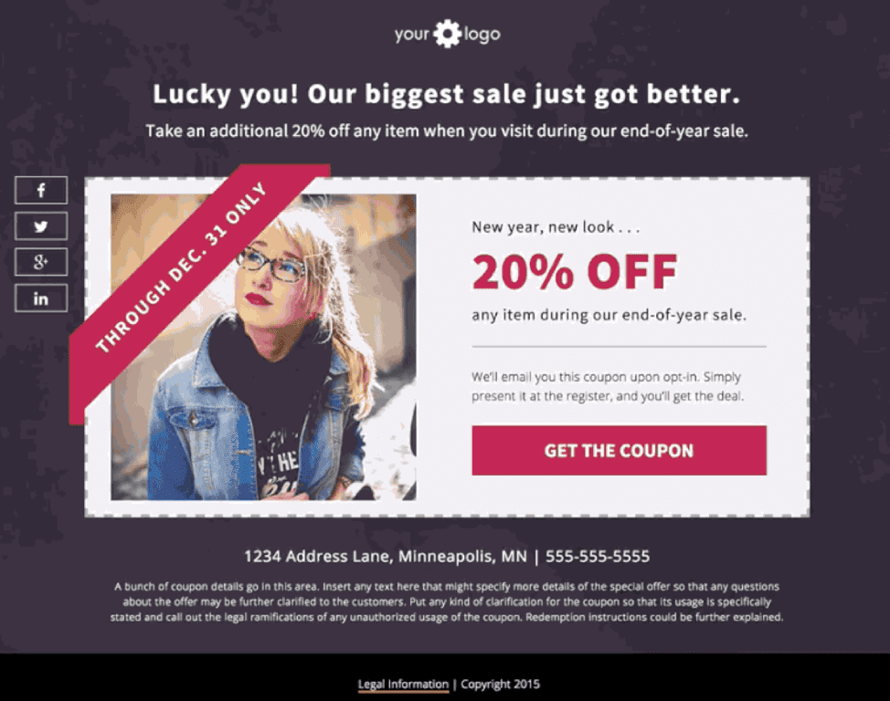
In this lead magnet example, a free coupon is used as a freebie giveaway.
What’s a content upgrade?
A content upgrade is a specific kind of lead magnet designed especially to offer on one particular blog post. You can think of it as the milk to your blog post’s cookie, or the wine flight designed to pair with a good meal. It enhances the information you’ve learned in the post and perhaps makes it easier for you to implement in your life.
What are the different types of leads?
Most small business owners offer more than one product or service—which means their lead generation will focus on acquiring a few different kinds of leads.
Therefore your lead magnets should be tailored to your audience and the types of leads you need for your marketing/ sales funnel. This can be done by identifying who they are, what their primary pain points are, and how you can deliver value via free content. From there you can begin to brainstorm which content/ style of lead magnets your audience would benefit from and begin your lead magnet creation process.
How do I know if my lead magnet or content upgrade is good enough?
Of course, the surest way to know what kind of lead magnet will get downloaded is to put it out there and watch what happens.
If you’re wondering what a strong lead magnet conversion rate looks like, the best place to look is at your historical performance and what’s worked in the past for your particular audience.
Then again, if you’ve got a certain number of leads or sales you need to make this month or this quarter, your risk tolerance might be a little low for that.
So you might want to test-drive your lead magnet idea first. You could:
- Send it out to a small group of trusted customers
- Broadcast your opt-in page to a very limited audience with a low-budget Facebook ads campaign
- Ask a few friends in (or outside) your industry to give you their thoughts
- Post in forums asking whether users would find value in the resource you’re considering creating
- If you’re a Leadpages customer, post it in the landing page’s traffic sources are effectively targeted in order to attract visitors that will engage with your lead magnet?
Want to know if your lead magnets are working? Test them! Utilize A/B testing to determine which types of lead magnets are more successful than others. You can also test which calls to action, headlines, and copy best “sell” your lead magnet. Learn how to test your landing pages here.
Bottom line: Lead magnets are the backbone to your landing page. Focus on creating a high-value lead magnet that will attract, engage, and convert your visitors.