5 Lead Generation Landing Page Examples To Get You Started
In this chapter, we’re going to take you through some of our most popular lead generation landing page examples. Leadpages offers pre-designed, mobile-responsive templates that you can quickly customize and publish without touching a speck of code. With the help of our drag and drop editor, every element on the page can be personalized to suit your unique business and campaign type. New customers come from carefully nurtured leads, which (often) come from lead generating landing pages. Lead generation pages are specifically designed to collect the contact information of your web traffic. This can come in the form of a name and email address, phone number, company size, etc.
Just swap out the images, tweak the sales copy, add in a call to action, click publish and you’re ready to start generating leads.
Check out our Landing Page Template Library to explore hundreds of options for your lead generating landing pages.
Ebook Landing Page Opt-In
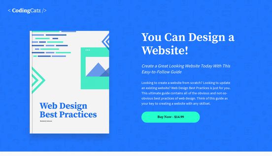
Modern Ebook Sales Page
Are you a budding author eager to build an email subscriber list by giving away an ebook, guide, or chapter? Collecting a lead list gives you a set of fans who are interested in what you’re offering, whether that’s a full book or a different product (like a course or speaking event).
Even if “writing” isn’t your primary field, ebooks are a great way for any individual or brand to share information with your audience. Your yoga studio could share an ebook of popular yoga poses, or an accounting manager could give an ebook filled with tax secrets.
Competition in the book/ebook marketplace is fierce, though. To cut through the noise and get the attention of your audience, you have to instill excitement right from the get-go.
This modern ebook sales landing page (which also functions as a “minisite”) helps you put your ebook, kindle book, or recent publication on display. You can provide a brief synopsis or sales pitch and then invite your audience to immediately take action.
We’ve even made sure that this template gives you the ability to give away a free chapter of your book. This both gives you a lead, because they give their email in exchange for the free chapter and it also hooks the readers to get them more excited about the rest of your book.
Want a shorter form ebook landing page? This 'yoga' ebook template works well to offer a free ebook as your lead magnet. We recommend this page for businesses who are pushing an ebook as a way to gain leads and build authority and credibility in their field, even if you’re not traditionally an “author”.
eBook landing page best practices:
- Create a visual mock-up: Even digital products benefit from a visual representation. A book ‘front cover’ makes your visitor feel like they’re receiving something tangible and valuable.
- Include a synopsis: When someone picks up a book in a bookstore, they flip it over to read the back cover to see what it’s all about. So, put a brief description on your landing page that works like the “back cover” of the book. You can do a short paragraph or bullet points. (A/B test to see which type of description your customers like most.)
- Include testimonials: Another aspect of the “back cover” is the testimonials from reviewers or other authors. It shows that people (especially credible people) have loved reading this book. Do this with testimonials or social proof on your landing page, whether it’s about the ebook itself or your brand on the whole. Social proof sells.
- Tease them with a few lines: Whether it’s a fiction book or nonfiction tips and tricks, give them a little taste of what they’re going to read inside. Including a few interesting lines from the book is a great way to whet their appetite and make them hungry for more.
Splash page landing template

Site Coming Soon
Splash pages “pop up” once someone lands on a page. They see it before they’ve even gotten to the main content of the landing page or website. We have splash pop-ups available as a feature for our landing page templates, so you can offer your lead magnet front and center as the first impression the visitor gets on your page.
We love this ‘site coming soon’ template because it’s so clean, but it’s super optimized for generating leads.
If you’re in the process of creating and launching your website, don’t miss out on the traffic you’re already getting. It will only take you a few minutes to get this splash page up and running, so you can start generating your customer or lead list.
Splash page best practices:
- Make it an invitation: Treat everyone who comes to your splash page as a ‘first-access member.’ Make them feel a sense of exclusivity by inviting them to get early access or get early-bird registration. This exclusivity will make them eager to give you their email address, and they’re more likely to become brand loyalists for life.
- Minimalist design: If you have stunning images or mockups of your product, service, or customers, use them frequently and liberally. Keep things simple and let the design do the talking. Show a sneak peek into what your brand is doing before the launch has even happened.
- Put the CTA button above the fold: Splash pages, in particular, have to achieve the whole pitch in a single screen view. They’re fast and furious, so you want to keep your value proposition tight and your CTA button above the fold.
Video course landing page template

Video Course Teaser Page
A video course is an awesome (and often underused) lead magnet that works wonders for capturing leads.
This video teaser page outlines the course with both visuals and descriptions. The actionable language to “reserve your spot” pulls people through to the next level, so they can get in on the fun. Just plug in your information, and you’re ready to work some magic for your video course.
Click here to get some info on creating an online video course as a lead magnet.
Video landing page best practices:
- Get on camera: Across multiple channels, video content has fabulous engagement rates. Seeing a face humanizes the brand while attracting attention. Find a way to communicate your message with this medium and you’ll delight your audience.
- Keep it quick: If you’re using a video on a landing page, aim to keep it under 30-60 seconds.
- Make it urgent and exclusive: The copy on this template works well by showing how much the course is worth… and then how many people will get the course for free. This demonstrates the value of the course while creating a sense of urgency to get the course while it’s still free.
Newsletter landing page template

Foodie Newsletter
Are you using an email newsletter as part of your email marketing campaign? Newsletters are hard work, but they’re worth it. They keep your leads warm by adding value and staying top of mind. Newsletters also work to passively sell your brand or products, especially when your leads have been reading (and loving) your newsletter for a few weeks.
If your newsletter is your primary lead magnet, this landing page template can show serious results for you. It goes through the most important aspects of subscribing to the newsletter with a simple CTA. Just tailor it to your business, and you’re ready to start collecting subscribers on the spot.
Newsletter landing page best practices:
- Start with the value proposition: What are they going to get when they subscribe to your newsletter? What kind of info are they going to receive, and how will it change their lives or solve their pain points?
- Use active CTA language: The CTA should reiterate what kind of benefits they’ll receive by subscribing. “Sign up” isn’t as powerful as “join the community” or “get the good stuff” (depending on your brand tone)
- Promise security: People want to know that you’re not going to spam or flood their inbox. Tell them how often they’ll receive emails from you, or let them pick their frequency and interests. Also, guarantee them that you’ll never sell their information. Give them security that you’ll treat their email address with respect.
- Reiterate the benefits of your brand: Who are you, and why are you such an expert in this field? Establishing credibility and authority tells people that the content they’ll get in the newsletter is worth the signup.
- Offer sample content: Give them a taste from last week’s newsletter so they can see what kind of stuff you send out. Let them experience the value firsthand.
- Show social proof: If they’re joining a community, they want to see what others in the community are saying. Show off your brand’s “vibe” and the people who are involved with your business.
Webinar landing page template

Management Webinar
Webinars are effective lead magnets because they’re high-value and they open up a conversation between the lead and the brand. (Webinars are also a great place to up-sell leads to become customers.) See the guide to running successful lead generation webinars here.
This webinar registration page utilizes conversion design practices to be one of the most effective webinar registration landing pages in the Leadpages library of landing page templates.
Webinar landing page tips:
- Include a countdown: A countdown generates excitement for the webinar, while instilling urgency for signup right now.
- Be action-oriented: Every CTA should get them pumped up to register for your webinar. Make it exclusive. Make it exciting.
- Show bite-sized benefits: See how this template lists three benefits in bite-sized pieces with a little graphic? People want lots of info in a short, succinct way.
- Talk about the speakers: Who’s going to be talking on the webinar? What are they going to be teaching, and how are they experts in their field? Prove your credibility and people will be eager to sign up to learn from these professionals.
Landing page templates for everything you need
Leadpages has pre-designed, easy-to-use landing page templates for any kind of lead magnet or offering you can think of.
See some more of our fan-favorite landing page design examples:
- Product sales page
- eBook download page
- Free consultation page (great for coaches!)
- Giveaway page
- ‘Invite a friend’ thank you page
- Thank you page
Check out our full Landing Page Library to search for the perfect template inspiration for your landing page!
Now, read on to see how you can use these landing pages alongside lead generating websites.