What’s a Lead Generation Landing Page and How Does it Work?
Do you want to generate high-quality leads around the clock and make the most of your marketing budget? (Umm...of course you do!)
This chapter will go over what a lead generation landing page is, how you can use it, and some of our (top-secret) industry tips and tricks to optimizing your landing pages to capture leads.
What is a lead generation landing page?
A landing page is a standalone web page that’s designed to present a single marketing promotion or campaign. Inbound traffic from paid or organic ads “land” on this page, and then they have the opportunity to engage deeper with the business.
Unlike a website, a landing page doesn’t direct visitors to different pages to learn about your brand. A landing page presents one specific offering, and it gives them a point of conversion right then and there for that offer.
Squeeze pages (a unique type of landing pages geared at lead generation) are designed to squeeze information out of your website visitors, specifically a name and email address. These pages use a lead magnet to capture and qualify leads and store them in your email database.
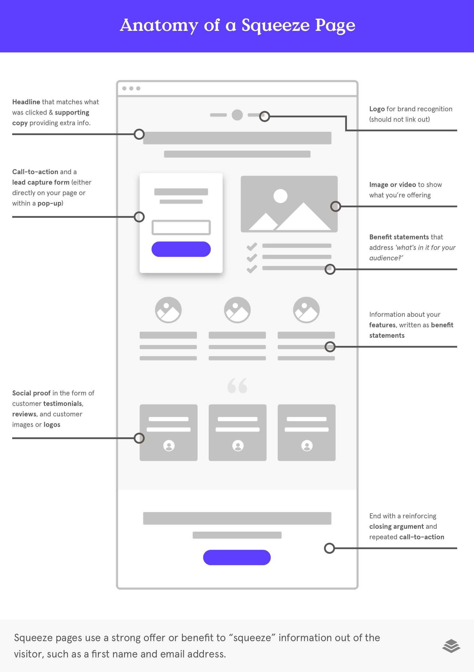
Here’s how it looks, broken down into steps.
- You’re offering a free webinar.
- You put out advertisements and posts on Google and social media about your webinar.
- Some people who are interested will click on the ad, and they’re brought to your webinar’s landing page.
- On that squeeze page, they’ll decide whether or not they want to participate in the webinar, based on the content you provide to convince them how awesome the webinar is.
- They’ll give you their basic information, like their email address, to “reserve their seat” for the webinar.
- Now you have a new attendee for your webinar, and a new lead in your email list!
That landing page was entirely designed to convert traffic into webinar leads. There weren’t any other CTAs or information that wasn’t relevant to the webinar.
So how do you create a landing page for lead generation?
What should be included on a landing page?
- A lead magnet (that your audience actually wants)
- Form to capture information
- Stellar headline
- Brief description of the offering
- At least one image or video
- Testimonials or logos that provide credibility
1. Magnetize with the main event
Lead magnets are the main attraction of your landing page. Before you can even make a landing page, you want to create a high-value lead magnet that’s targeted directly at your audience. It’s this lead magnet that’s the backbone for the rest of the page.
What is a lead magnet?
A lead magnet is an offer that attracts leads to give you their information.
The vast majority of people are not ready to make a purchase when they first interact with your brand. But freebie content like a lead magnet can pique their interest and delve deeper with you. Once you have their contact information, you can nurture them and stay top of mind, so they come to you when they are ready to buy.
How to create a lead magnet
The lead magnet should have three goals:
- Solve the visitor’s pain point
- Be unique, different, and valuable
- Deliver immediate results
Create a lead magnet that customers want to download. It should solve a problem they’re facing, and that solution should be unique and immediate.
The more unique it is, the more likely they’ll want to give you their information in exchange for it. If they could Google that topic and get that same sort of resource without handing over their email address, they’ll just go elsewhere.
You also want the lead magnet to be immediate. People seek instant gratification. It makes them feel good about your brand. The faster your audience can use your lead magnet (and see results from it), the faster they’ll associate your brand to that value.
Lead magnet example
Let’s say that you’re a wedding photographer. You create the lead magnet: Ultimate Checklist To Make Your Wedding Gorgeously Photographable.
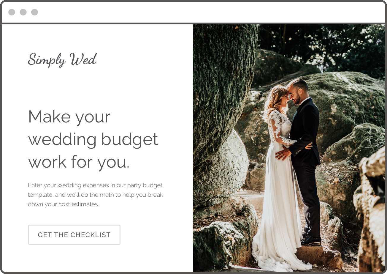
It’s related to the wedding industry, and it also leaves a lot of room to talk about your services in the checklist or guide.
But it’s also specific and unique. It’s not just how to plan for a wedding. It’s how to design a wedding that will look great in photographs.
People will read this checklist today, and they can start implementing the items from this checklist during their wedding planning. It’s there for immediate use, which provides instant gratification.
Once they see that your checklist is useful, they’re more likely to come back to you as a viable candidate for their wedding photographer. They’ll love the advice you’ve given them, and they’ll trust you know what you’re doing.
One page = one action
Each landing page should have one action and one action only. Don’t dilute your page with lots of offers or gimmicks. Leonardo Da Vinci said, “Simplicity is the ultimate sophistication.” And this definitely applies to landing pages. Focused minimalism tends to generate the most and the highest quality leads.
A strong CTA correlates with the current engagement level of your visitors. In the above example with the wedding photographer, most of that traffic is probably “cold” if they came in from Pinterest advertisements, for example. So the lead magnet focuses on grabbing their email with a simple, high-value magnet, like a checklist or infographic. It’s a low barrier to entry but with a large reward.
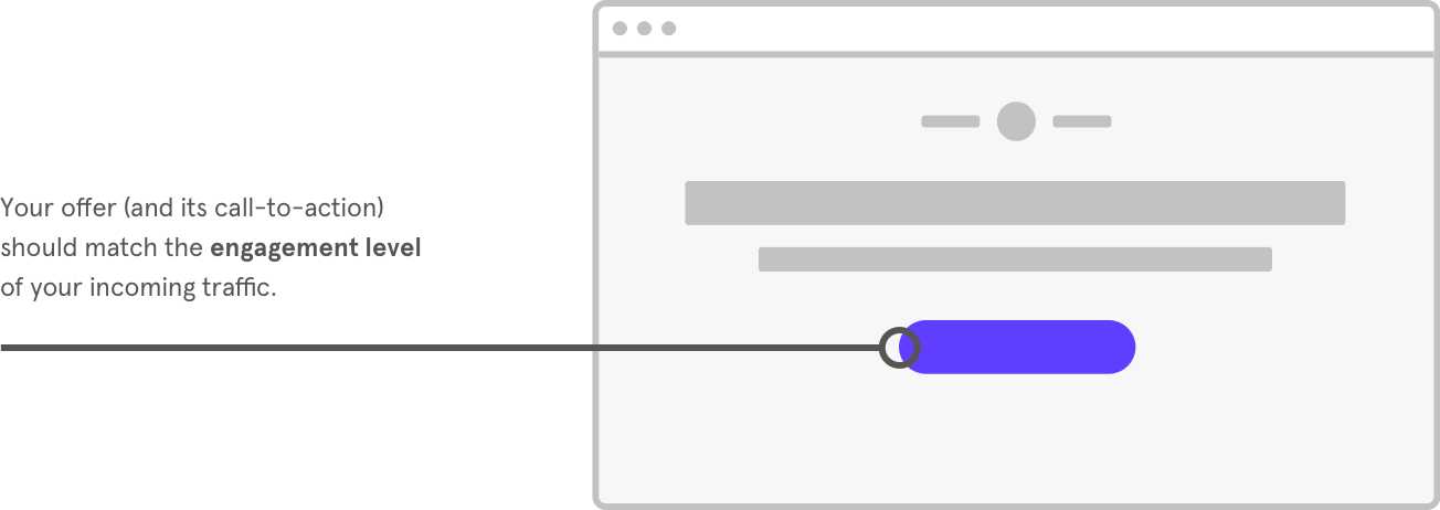
But let’s imagine you’re marketing to a list of “warm” leads. Your landing page might seek to create a deeper engagement so the leads are more likely to book their wedding with you. The CTA instead might be to sign up for a free wedding videography webinar or a free venue shoot consultation. This creates a stronger connection between lead and business while still providing value to your leads.
Consider the goal you’re trying to reach and create the lead magnet based on that objective.
2. Minimize friction on the form
The opt-in form is where you actually collect leads. It’s the “net” of your lead capture landing page.
People will give up on even the best lead magnets if the form is too complicated or time-consuming. So try to use as few form fields as possible, and keep the required information simple. First name and email address are usually enough to do it!
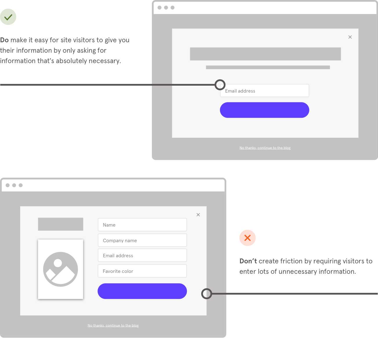
They’ll also give up if the form feels insecure. So, make sure you promise not to spam them and show some sort of security logo if relevant. This tells people that you’re not going to use their info willy nilly. It demonstrates credibility and respect for the consumer that’s critical to getting them to convert.
3. The headline is the value proposition
Now that you’ve created the perfect lead magnet that will engage your audience, you want to architect the landing page in a way that will promote that lead magnet.
The first rule of thumb: Put the value proposition front and center.
Did you know? Your visitors have an average attention span of about 8 seconds. That means they’ll likely read the headline and see the design before deciding whether or not they want to consider your offer or click away. So your headline needs to tell them exactly what they’re getting and why they need to engage.
For example, a strong headline might be: Lose 5lbs this week with our free No-Gluten Diet plan!
A weaker headline might be: Get the Gluten-Free Diet plan.
The second headline describes the ‘what’ but not the ‘why’. And it doesn’t create an emotional response or compel the reader to take action. The first headline is more powerful because it tells them what the offer is, what their results will be, when they’ll see those results, and how they’ll get those results (by downloading your lead magnet).
Give them as much as you can in the headline to explain what the end results of this lead magnet will be. (But try not to be too wordy.)
4. Point everything in the direction of the lead magnet
Everything on your landing page should be about your lead magnet. Every word and visual is there to provide information about the benefits of the lead magnet.
That doesn’t mean you want to just list the benefits, though. You need to create an emotional response. You want to tell a story. Share a vision about what this offering can (and will) do to improve their life.
This applies to testimonials and customer reviews as well. You don’t want just overall testimonials about an irrelevant product. Keep the testimonials about this specific lead magnet or your overall brand.
Not sure how to tailor your landing page to promote your lead magnet? Check out these awesome resources:
There’s a lot that goes into making a landing page super optimized for conversion. We have an entire guide just about how to improve your conversion rate by designing and optimizing your landing page. Check out the conversion optimization guide here.
Some quick tips to help you get started:
- Pick a color palette and stick to it. Put the CTA in a different, bolder color. Contrast is the key to getting your visitor’s attention.
- Use a simple, easy to follow layout. Minimalism looks and feels “cleaner.”
- Use design to tell a story and evoke an emotional response. How you present the page tells people how to feel about the offer and your brand.
- Repeat keywords and phrases. This drives home the main point while optimizing for search engines.
- Make your copy easy to scan. Skimmability means faster decision making.
- Reiterate the messaging and offer you used in your initial ad or post (the one that brought the traffic to this landing page).
- Use lines and arrows to direct people’s attention where you want it to go.
- Reword your CTA button to make sure it has actionable language. “Start now” isn’t as powerful as “Get my free book.”
- Focus on the benefits and how it will impact your lead’s life. What sort of results will they experience after they use your lead magnet?
- Create limited-time offers that increase the urgency and exclusivity of the offer.
- Remove all distractions. Stay focused on the one, ultimate goal and push all design and content that way.
- Don’t forget your logo. (But you don’t need it more than once.)
- Make sure your landing page is mobile optimized.
- Run A/B testing to make sure each feature is optimized for conversion.
Keep in mind that users spend 69% of their media time on their smartphones. If someone finds you while they’re on the move, chances are they’ll forget about you by the time they get home. Your website and landing pages need to be mobile-friendly to grab those on-the-go mobile customers.
5. Make it visual
Landing pages with images and videos perform better than plain text. You want your customers to see what they’re getting and understand how their life will be better with this lead magnet.
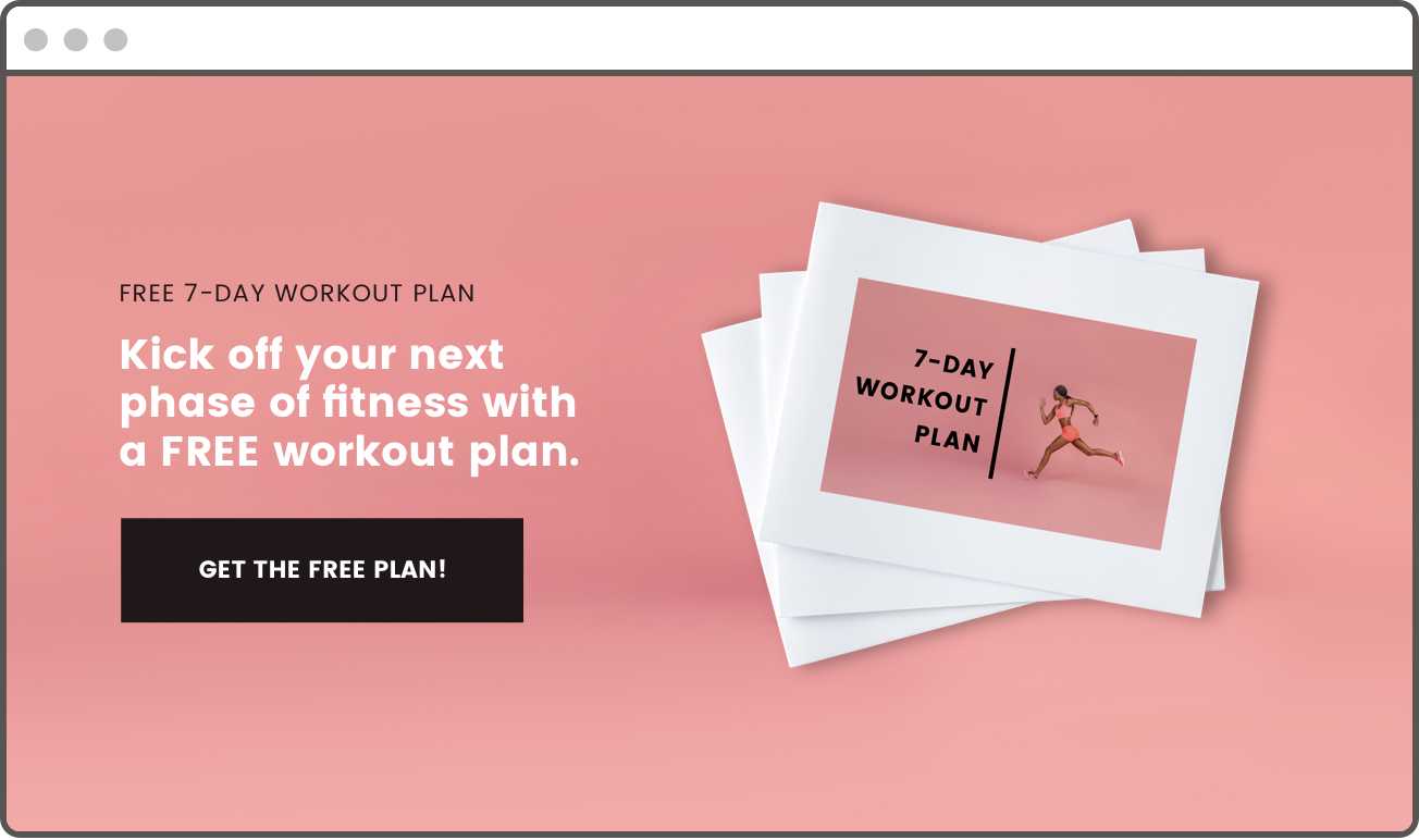
That doesn’t mean you need to spend a lot of time and money to create images and videos specifically for your lead magnet (although, if you have the resources available, it might be worth it). Videos about your brand or images of your products or customers work well to attract attention, too.
A video itself can be the lead magnet. If you have a unique how-to video or short video class that solves a pain point for your audience, you can gate it with an email address.
Integrate your landing page
Leads are just the beginning. Typically, when someone inputs their email address in exchange for a lead magnet, they’re hoping to receive their offer right away.
This means you’ll probably need integrated software on your landing page that lets them have instant access or instant downloadability.
Or, you’ll want to make sure that inputting their information into the form triggers an action that sends them an email with the appropriate offer.
Check out Leadpages integrations to unlock the unlimited possibilities of your landing page.
Landing page for lead generation
Landing pages are made for lead generation. (In fact, landing pages are also called lead pages for that reason.)
So we usually recommend that clients create one unique landing page per call to action and lead magnet. The more specific and directed your landing page is, the more likely it will convert the leads you’re looking for.
Landing pages are made to turn visitors into leads and leads into customers. Lead generation landing pages are one of the most effective ways to capture traffic, so you can have a warm list of leads excited to hear from you in your marketing campaign.
Get specific landing page lead generation examples in the next chapter...